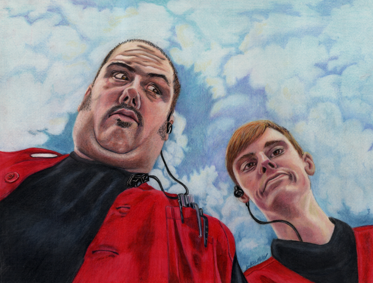
I am an art instructor at our local Ye Old Art Shoppe , and have been trying to explain to my students that in actuality white is hardly ever pure white. Even thought our eyes perceive it that way. So to demonstrate this I took the below photo and took it into photoshop and pulled touches of color out of it’s surroundings, just so the student could see the true color they were seeing.

Not only is white not always white, it is not necessarily as light as our mind thinks it is either. You will see here how dark some of these “whites” actually are and how they are not really white at all. We have mauves, blues, and beige, warm gray, cool gray and sand colors; but Wait! Where are the whites?
Making a chart like this is so helpful even to an experienced artist as our minds lie to us constantly. It is nice to be able to hold your color pencil right up to the local color and be able to make the correct decision even if it feels like it is totally wrong.
It will be difficult to trust it and actually put that color down, but until you do your paintings, drawings are not going to read as real.
My students give me a hard time because I am always talking about getting the values (Light and darks) right. Values are the most important thing in being an artist, at least as far as I am concerned. This photo shows us that even a dark gray can appear to be white when it is place where it is surrounded with darker values. In fact if you practice at getting the values right, soon enough when your dark values are right, you will start to notice right away that placing the white beside it is way to bright and to great of a contrast!
Another note to shades of white is that white that is facing a light source will be warmer. Yellows, pinks, or beiges may be used. Those whites that are in shadow or even facing the sky will be more Blues, purples or greens. Depending on that colors surround them will decide the value of the “white” Not white areas. You should practice this by painting something that is white. Paint a white flower, or a white cat! Something that will force you to see the other colors that are in the whites.
This is also truth for Black. Black is hardly ever black. In fact, using straight black will also make your painting look flat and boring. Mix some blues or purples, maybe some reds or browns in with your blacks. Just as white has warm and Cool tones, so should your blacks.
Remember that your mind lies to you. We have an amazing brain designed by an amazing God. This brain fills in the gaps of us so that the brain doesn’t have to work so hard. This is why we see “White” or “Black” when there is no white or black present. Our mind makes it consistent and simple for us to understand so our mind can rest and not burn out by being too stressed.
Once you train yourself to see the other colors in whites, and the blues and purples in the shadows… It will blow your mind! I love it! I don’t look at anything the same anymore. If I am sitting looking at a beautiful landscape, I am marveling at the colors. If I am sitting and talking to you, I am wondering what colors I would mix to get that beautiful reflected light that bounces off the underside of your jawbone or the underside of your brow.
Color and value, shadows and light, they are so very beautiful and so necessary to show case one another. If your artwork is looking a little flat, you probably need to punch your not black darks darker and your not white lights a little lighter.
Hope this was helpful! Have Fun Creating!
![]()

Check out my online Portfolio @ Jackielittlemiller.com