Grief is a Strange Animal

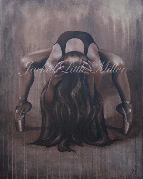
It has been Six months since my big sister/ best friend passed away. Six Months of grieving, six months of not being able to breath, six months with very little creativity and art; and Four months since I created my last piece titled A Time to Mourn. Though it may be my best to date. It expresses my grief more then I could ever express it with words.

WM Time to Mourn FB

Grief is such a strange animal. I thought I knew this beast well, because I have met it on many occasions before.

This time somehow, it seams bigger and meaner. It seems to have backed me against a wall separating me from my creative side. It seems that with every attempt to vest this beast I am left feeling as though I have lost my artistic balance and I drop my brushes in defeat, frozen, temporarily paralyzed and unable to move my arms and mind into submission.

But I am not one to give up, I am brave, and bull headed. So I keep charging in and making myself go though the motions. Knowing that deep inside me creativity is alive and well and will eventually surface and be the victor. Each day I am desiring more and more to create again. I want to force myself past this dragon of grief and go to my favorite place to live, in the land of laughter, sunshine and creating things. Because I just want to be happy again.

I have to say though that It is not a scary monster, it’s just big and in my way and becoming very annoying. Like Rex from the movie Toy Story where he says “I’m going for fearsome here, but I just don’t feel it. I think I’m just coming off as annoying.”

I know that this beast called grief is not my enemy, or an enemy to my art. He may even be there, larger than life, to protect me from something that would wound me deeper while my heart heals.  I need to let him stand there and do his job. In the end it will cause me to be a better artist, painting with more feeling and emotion.

For without the darkness, one can not truly enjoy the light. Without the tears and pain, one can not truly appreciate the laughter and Joy. Without the experience of devastation one can not truly appreciate the creative process.

Thank you all for being so understanding and supporting me during this painful time for me. May God richly bless you!

It’ Not White

I am an art instructor at our local Ye Old Art Shoppe , and have been trying to explain to my students that in actuality white is hardly ever pure white. Even thought our eyes perceive it that way. So to demonstrate this I took the below photo and took it into photoshop and pulled touches of color out of it’s surroundings, just so the student could see the true color they were seeing.

tigers-color-breakdown

Not only is white not always white, it is not necessarily as light as our mind thinks it is either. You will see here how dark some of these “whites” actually are and how they are not really white at all. We have mauves, blues, and beige, warm gray, cool gray and sand colors; but Wait! Where are the whites?

Making a chart like this is so helpful even to an experienced artist as our minds lie to us constantly. It is nice to be able to hold your color pencil right up to the local color and be able to make the correct decision even if it feels like it is totally wrong.

It will be difficult to trust it and actually put that color down, but until you do your paintings, drawings are not going to read as real.

My students give me a hard time because I am always talking about getting the values (Light and darks) right. Values are the most important thing in being an artist, at least as far as I am concerned. This photo shows us that even a dark gray can appear to be white when it is place where it is surrounded with darker values. In fact if you practice at getting the values right, soon enough when your dark values are right, you will start to notice right away that placing the white beside it is way to bright and to great of a contrast!

Another note to shades of white is that white that is facing a light source will be warmer. Yellows, pinks, or beiges may be used. Those whites that are in shadow or even facing the sky will be more Blues, purples or greens. Depending on that colors surround them will decide the value of the “white” Not white areas. You should practice this by painting something that is white. Paint a white flower, or a white cat! Something that will force you to see the other colors that are in the whites.

This is also truth for Black. Black is hardly ever black. In fact, using straight black will also make your painting look flat and boring. Mix some blues or purples, maybe some reds or browns in with your blacks. Just as white has warm and Cool tones, so should your blacks.

Remember that your mind lies to you. We have an amazing brain designed by an amazing God. This brain fills in the gaps of us so that the brain doesn’t have to work so hard. This is why we see “White” or “Black” when there is no white or black present. Our mind makes it consistent and simple for us to understand so our mind can rest and not burn out by being too stressed.

Once you train yourself to see the other colors in whites, and the blues and purples in the shadows… It will blow your mind! I love it! I don’t look at anything the same anymore. If I am sitting looking at a beautiful landscape, I am marveling at the colors. If I am sitting and talking to you, I am wondering what colors I would mix to get that beautiful reflected light that bounces off the underside of your jawbone or the underside of your brow.

Color and value, shadows and light, they are so very beautiful and so necessary to show case one another. If your artwork is looking a little flat, you probably need to punch your not black darks darker and your not white lights a little lighter.


Hope this was helpful! Have Fun Creating!

icon-etsy

captivating_Miller_08g

Check out my online Portfolio @ Jackielittlemiller.com