A Time To Mourn

Time to Mourn FB

As many of you know, I lost my sister/ best friend recently. It has left me unable and some times unwilling to express my emotions. Which is strange because this is what I do, I put my feelings onto words, whether in poetry, song or in some cute way to make us all laugh at our circumstances and feel better about them. But Now, I’ve got nothing! No words will come out, they will not even form in my mind, and even when they do they refuse to come out of my mouth in any coherent manner.

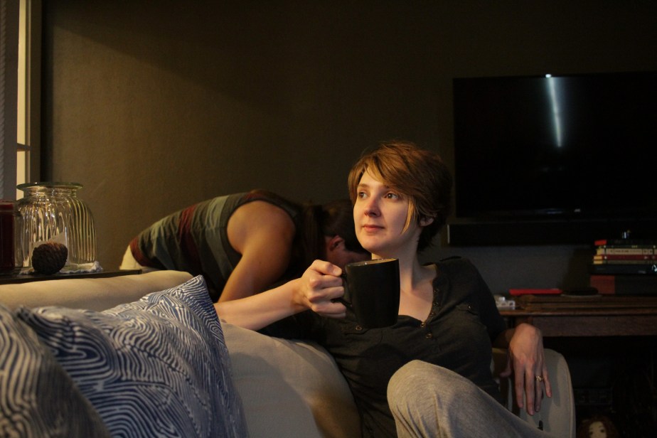
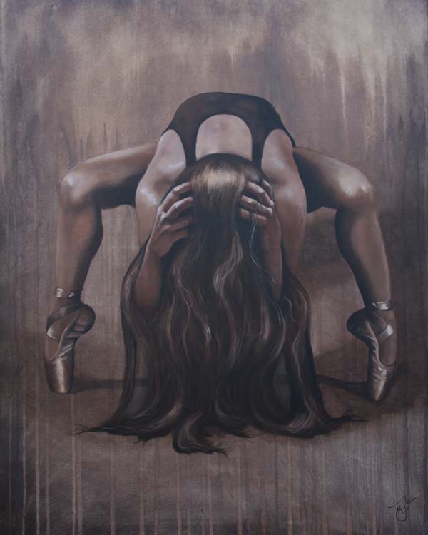
Being an artist, I turned to painting for my therapy, or processing of my emotions. My original thought was to just do something simple. I can’t concentrate long enough or even care enough to focus on doing a portrait and make sure that it looks like a specific person. I had painted a few dancers and thought I could continue in that series. After asking for help with reference photos from my friends on face book, I was overwhelmed with the out pouring of responses. Several photo were dramatically lighted and drew my attention and so I pulled one of them and started considering the composition.

26943196_1796918696999677_919508536_n

Original reference photo from Melodie Lauhan

That night as I was falling asleep I envisioned a dripping background to this piece and that I could do in monotone in sepia colors. So the next morning I started to paint.20180203_132423

Once the background was painted and dry I traced on my drawing of the dance just like in the photo. Then I started blocking in her form.


But the more I painted the more I felt the sadness of the piece, as if I was painting my pain. So instead of trying to fix it and make it brighter or happier, I decided to embrace the pain, crying with every brush stroke applied to the canvas. Soon I realized that this dancers pose was not expressive enough to show the depths of grief that I was feeling. So I decided to move the arms and make her holding her head.


I moved her hands several times before getting them exactly where I wanted them also changing the tilt of her head. I was even blessed to get my Photographer son Isaiah Miller to photograph my beautiful daughter in law in the hand pose I needed, and under the same lighting conditions as the original reference photo to make it easier for me to paint it correctly.The problem I had now was that  I could not repaint the background as I loved the feeling of the drips so I had to hide the painting of the hands on the floor in the hair. Since my daughter in law has such lovely long full hair, this was an easy transition.


Once the detail in the hands and body were complete I felt I needed to clothe her in black to finish the look of one who mourns. Once that was done I felt that I had achieved expressing my inner most emotions. I hope that you can feel what my heart is saying and I hope that it touches you deeply.

Please leave a comment telling me how this piece makes you feel and what it tells you. I would love to hear from you.


Grey in Gray

I have been absolutely slammed with wedding prep for my youngest son’s up coming marriage since returning from Florida to witness the birth of my eldest son’s first baby. Since I was there during the photo shoot (which included this amazing photo) I was quick to ask the photographer for permission to paint any of the photos she was about to take. With delight I was glad to hear her say “I was hoping you would ask that! Yes!”

View More: http://naomilynnphotography.pass.us/grey-thomas-miller

Photo by permission of naomilynn.com

Even as I sat on the sofa in my son’s home looking at the photos that the baby’s aunt Naomi took, I have been anticipating painting this photo. My son’s mother in law even offered to get me some art supplies so I could get started. But I chose to put aside my painting and just hold the baby for as long as I was able, before I had to head home to Oregon. SO even though I am slammed with wedding prep, I still snuck in a few hours here and there to paint this piece entitled Grey in Gray.

My students had asked me if I would teach a class on values once I returned home. So I thought what would be more appropriate then a gray values painting of baby Grey. (Even though I would have painting him for any excuse and will be for a long time I’m sure.)

So like always I started by taking my photo into photoshop and turning it into a black and white. Then I had a nice 8 x 10 glossy printed up and printed out a b&w photo copy as well.

0329171715

Using my values chart on the photo I then use the photo copy to write the corresponding value on the areas I had just checked. I did this twice as the photo was dark then I wanted the painting to be. The colored photo looked light and fresh but once I transferred it to b&w it was a little darker and I wanted a lighter feeling to the painting. So once all my basic values were charted I stepped them up 2 or 3 values and re-wrote out the corrected numbers on another photo copy.

To avoid any mistakes I then threw away the first photo copy with the original numbers on it. I did not want to take the chance of picking up the wrong copy and getting the values all mixed up on the painting. So then I blocked in the basic values on the different areas of the painting.

0323171622a

Being that this was a painting of a very soft baby, I wanted the canvas to be very soft as well without a lot of grain to the canvas left. So I primed it again with a layer of gray gesso before beginning the actual painting, then sanded it smooth. This was one of the smoothest paintings I have ever done. I really like having a smooth canvas and it gave the affect I wanted it to have. I did find myself painting and then taking a dry brush and dabbing at it to smooth out and blend colors. I really haven’t done that much before but it gave the skin a very natural soft texture that looks and feels very much like baby skin.

0325171232

Once I got all the areas of the painting blocked in, I let the painting dry for a couple of days. Then when I was able to squeeze in a little more time on him I started to put more detail and more subtle value changes in. This was so much fun as I saw with every stroke that my grandson’s face was taking shape. My daughter in Law’s face came together just as quickly and beautifuly. I love this part of the painting as you really do start getting a 3 D affect as you put in more and more values.

0325171758

So again, it was time to let the painting rest and dry.

NOTE: I used Golden Open white titanium paint for this painting and mixed it with the regular Golden brand acrylic paint. Acrylic paints dry very fast, but the new Golden OPEN paint will keep the dry time open for a much longer time, giving me the time I need to blend subtle value changes! Which I love.

But unfortunately, this paint reactivates up to and past 3 weeks. Which means that this morning when I went to put on the finishing touches like adding final highlights, instead of adding, it actually lifted the dry color off, creating and very blotchy look, Which I, well, lets put it this way “Hate is a strong word, but I really really , really don’t like you! ” I can’t help myself!  I burst into song lyrics at random points all the time. LOL! i would always rather laugh then cry and that was my option now. So I decided to sing!

So to fix this paint problem, I had to spray the painting with a clear spray varnish to seal off the underpainting, so that nothing would move once I started to put on the highlights and hair details. This worked great. I hope you like it! đŸ˜€

0329171652b

Thank you for taking your time to read about my work process. If you would like to check out my other pieces please click jackielittlemiller.com

Dream Dancer

leap-of-faith-8 
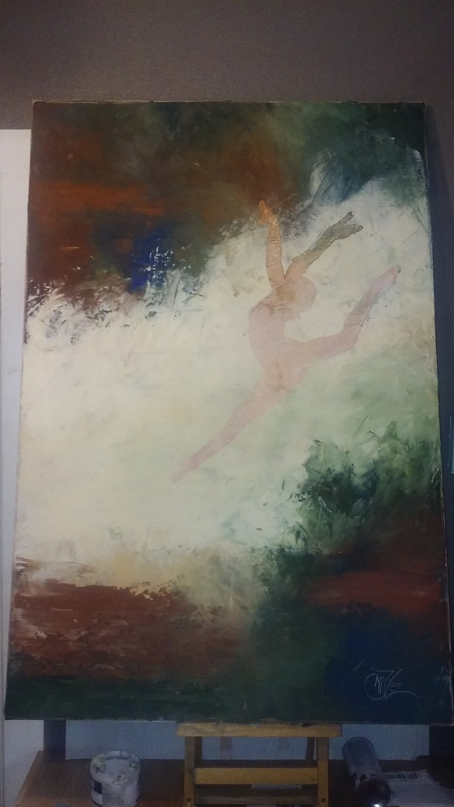
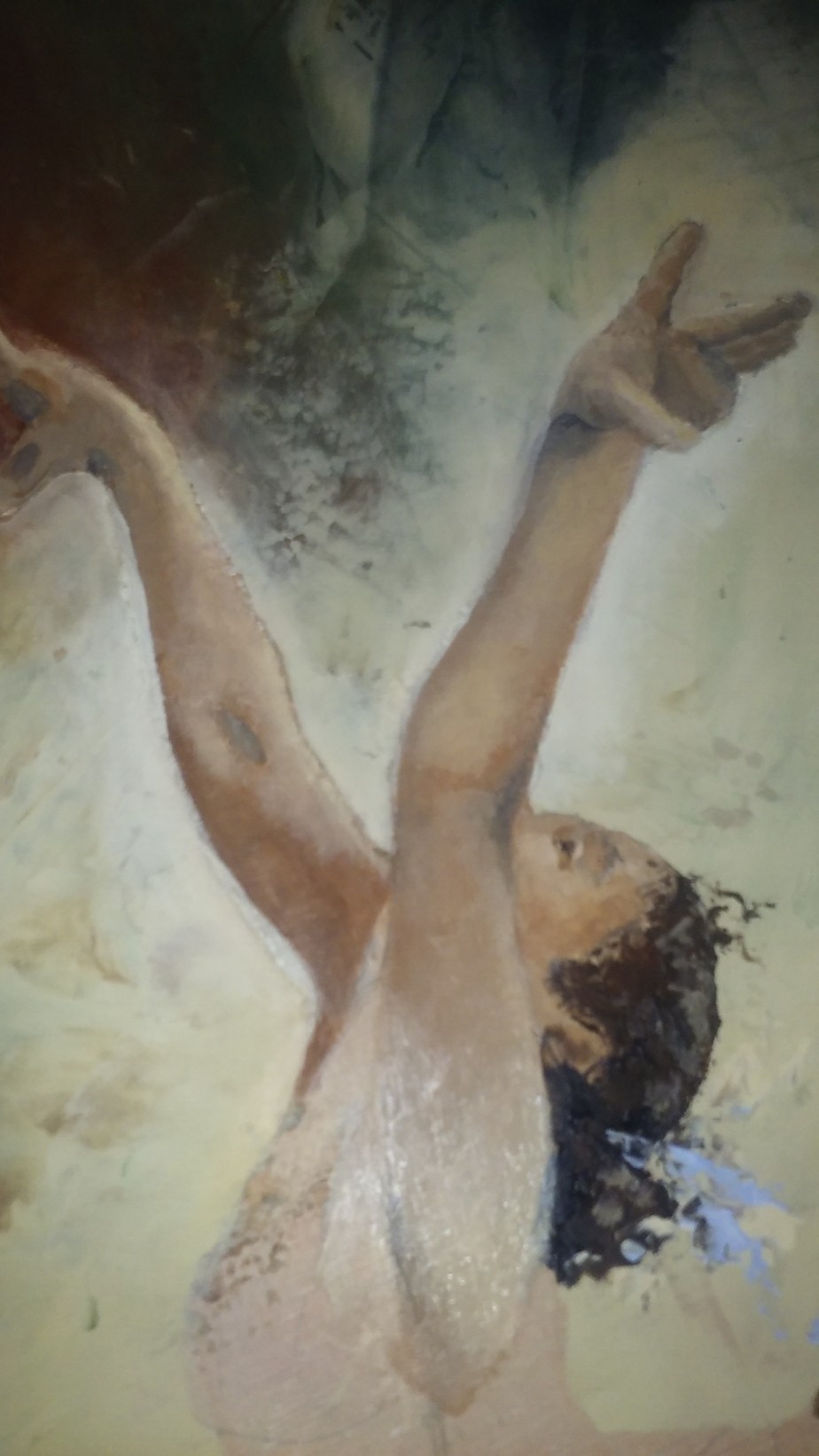
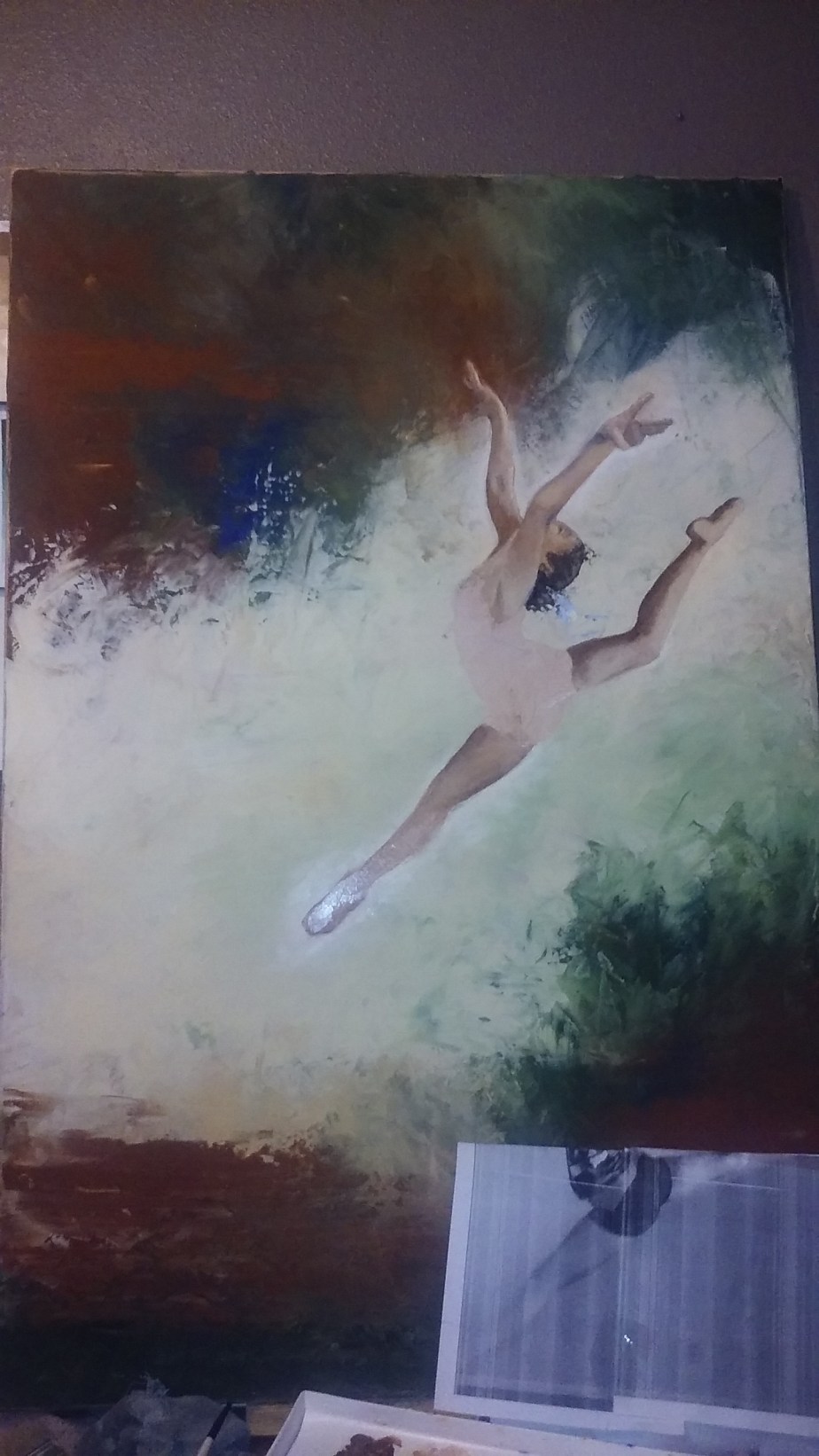
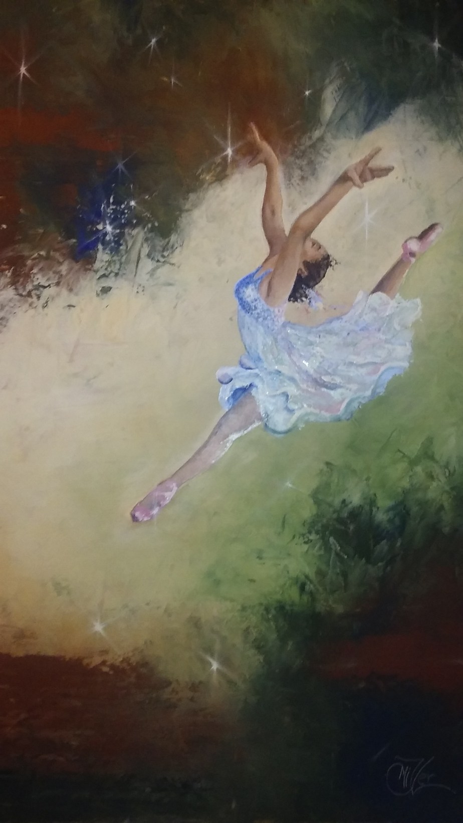
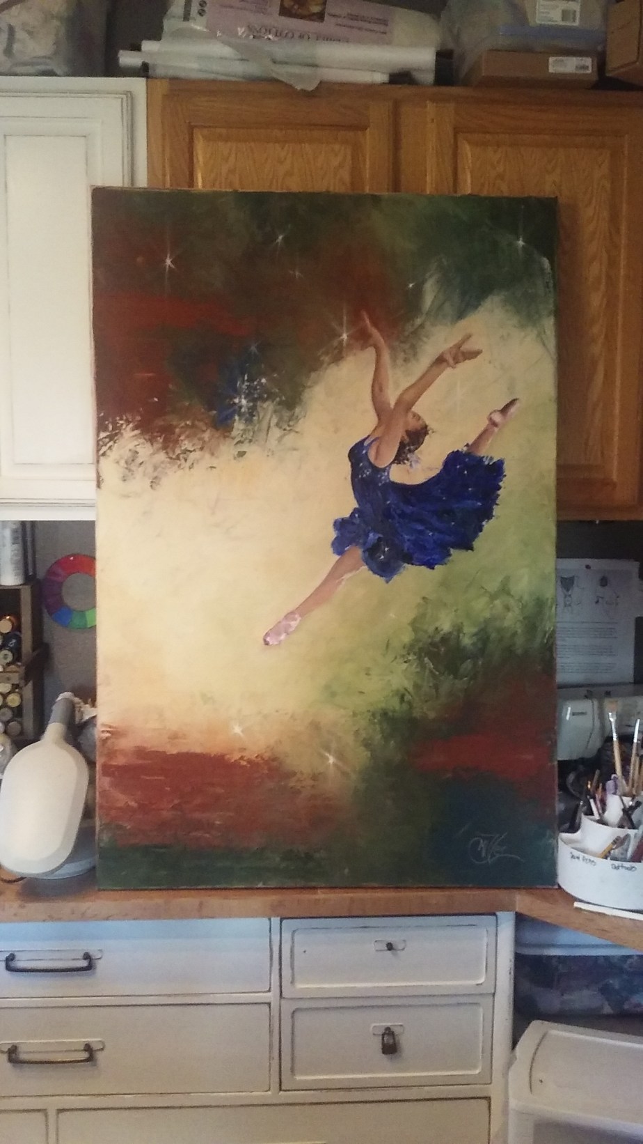
So you might remember my Leap of Faith painting from about a month ago. This one I did for my Granddaughter who was the subject of the reference photo I used. i really liked the way that painting turned out so I wanted to try it on a larger scale. So I pulled out a 4ft by 2.5ft canvas I have had laying around and started to sketch out the leaper in a larger format to fit the scale of the new canvas.

I wanted this piece to be mostly a knife painting so I added a texture paste medium to my paints so the knife strokes would hold their shape as they dried. Being that the canvas is very large it did take me the whole jar of medium! Wow! But I was very please with how the background turned out.

I had drawn the figure on the canvas before starting and did a base coat of a watered down burnt sienna just to take away the scariness of a blank white canvas. But as I was laying the thick background color paint on the canvas  I kind of lost the edges of the figure so I just decided to cover the whole canvas with background then redraw the subject later.

Once I had the background knifed in I started to rethink the whole waiting till it dried to draw in subject. After all if I wait then the subject will have weird texture in strange places making it not read right. So While it was still tacky I placed the drawing of the dancer on top and intended to just use the indent of the pencil edge to make a trace line, not using any carbon paper as to leave a dark mark. I actually thought that i=this would just leave and slight indent in the paint giving me enough information as to where to place the subject. But when I pulled the paper off the outline of the subject came with it leaving a rough edge.0118171501

This is one of those things that Bob Ross would call a happy accident. I loved the roughness of the edge! In fact I considered leaving the painting as it was, but quickly changed my mind as I still wanted to work more on her. so I scraped out the inside of the outline so that I could start painting the gymnast.

0119170900a

Here you can see the rough edges around the subject. I think it adds interest to the piece. Anyway as I finished up with the skin tones I realized that this was not a gymnast but a dancer. I’m the artist I can make these kind of decisions! LOL! She needed a pretty flowing dress and some point shoes. What do you think?

large-leap

So I started painting her dress. I liked the blue from the background as there was just a touch of it. So I lightened it and made a pretty pastel chiffon dress. This I did totally with the edge of the paint knife and lots of paint. I was very pleased with how it turned out0120171925a

But the next morning I was rethinking it. Though I still loved the dress it just didn’t make the dancer pop! I mean I loved the skin tones and how rich it felt, but the dress kinda made her look, well unfinished, flat, she just didn’t make the statement I wanted her to make.

So I took the photo of her into photo shop and did a quick dress color change on her. Now I am not skilled in photo shop at all and there was probably a much better way of doing it then what I did , but this worked. So I pulled colors from the background and laid in the color into the dress.

After showing these choices to a couple of artist friends of mine I decided on the dark blue dress. I just felt if gave the feeling I wanted and the pop that it needed. My daughter even suggested that I could put some sparkle stars in her dress echoing the galaxy feel from around her. SO I did. And Here she is finished.

Dream Dancer

31″ x 47″ x 1″

Acrylic on Gallery wrapped canvas

$1,000.00

0127171207b

Once I get a good photo of her so prints I will finish her with a couple of layers of gloss varnish. This is also My first piece with my new signature that you will be seeing on all my works from this point out.!

0131171033

God bless your day and Thank you again for following my Works In Progress!

captivating_Miller_08g

Quiet Time

It seams like I have gone from a year long dry spell to an oasis of ideas. Working on several pieces at a time. This painting was so much fun and yet so much of a challenge. I wanted to do her with a loose brush stroke to give it a relaxed feeling as the pose is of my daughter Jenny relaxing and with me and a cup of hot chocolate. As I often do as I am talking to someone I think of how I would mix the colors to paint her face or the color of reflected light that catches her chin. Then I was struck by her relaxed pose and did the mom thing and pulled out my phone and snapped a few quick shots before she realized I was doing so.

img_0758

SO of course I started with a sketch and traced it onto my canvas as always. I worked on blocking in the back ground and then started on the face. I know I should do other things first but I am like a kid in a candy store when it comes to painting faces. I just can’t wait to get at it. This painting proved to me a true test as I lost her face completely a hundred times. well maybe not actually 100 but close.

When painting faces especially portraits that  you want to look like a specific person, the larger the painting the easier it is to get those features right. This painting is only 12″ x 16″ So her face is only about 2″ big. this makes getting subtle value changes and warm light cool light areas a little more difficult. Plus at this size if you facial features are off by a hair width you have a different person interlay.

Also I had a hard time getting her eyes to look up like in the photo. This doesn’t seem to be that bad but even if the eyes are the correct shape it changes the mood of the subject. I wanted the upward glance because it was happy and hopeful. But I kept getting the straight ahead gaze which made her look sad or even one time mad, which was not what I wanted at all. Because it isn’t who my Jenny is. She is fun loving and cheerful and always thinking of new ideas. That is the feeling I wanted to capture.

This slideshow requires JavaScript.

Here is a quick run through of all the faces of Jenny! LOL! I know she is blue for a while, It was an underpainting that eventually got painted over also. These are just a few of the many faces. Over the weeks of working on her I would get so frustrated paint over the face and start again, working on something else on the painting until the face painted area was dry and ready to work again. This actually worked great because I had a lot of time to spend on perfecting the other area of the painting that I might not have taken if the face turned out great the first time.

Here you can see the purple underpainting of the shadows on the sofa and pillows which eventually got glazed a lovely sand color. It makes it a little hard to judge if you are getting things right when you paint things in colors that they are not going to be, but it is truly the values that matter the most so if they are right everything will turn out fine in the end.

It can be hard sometimes as I post my works in progress as I work on them. Sometimes that pressure makes me work harder to get it right, other times it makes me wish I would have kept thins one to myself! LOL! But even with all the frustrations I am totally excited about how she turned out.

fb-scan-jenny

Thank you so much for following my Works in Progress! You support and encouragement are so appreciated!

captivating_Miller_08g

Check out my online Portfolio @ Jackielittlemiller.com