First Steps

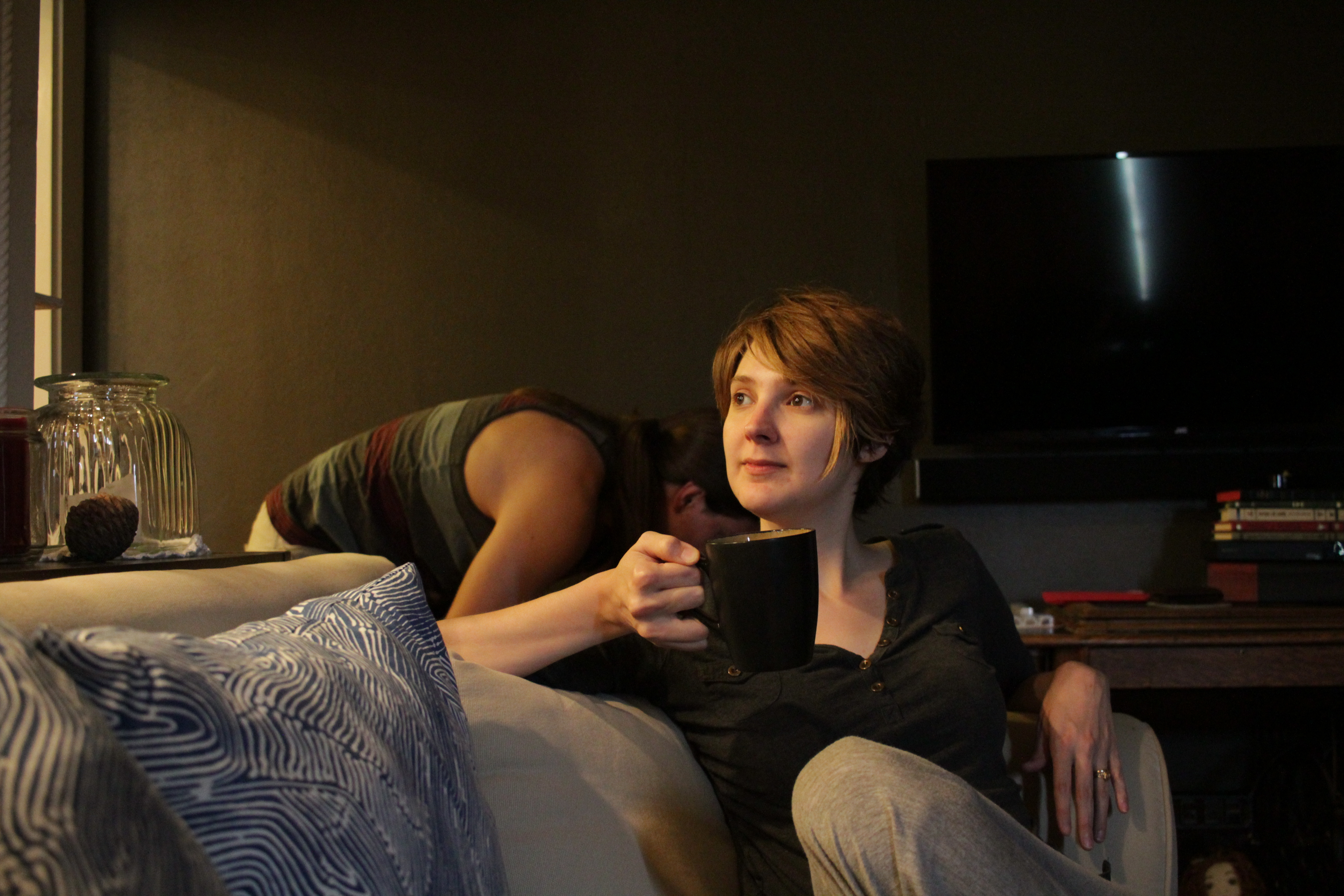
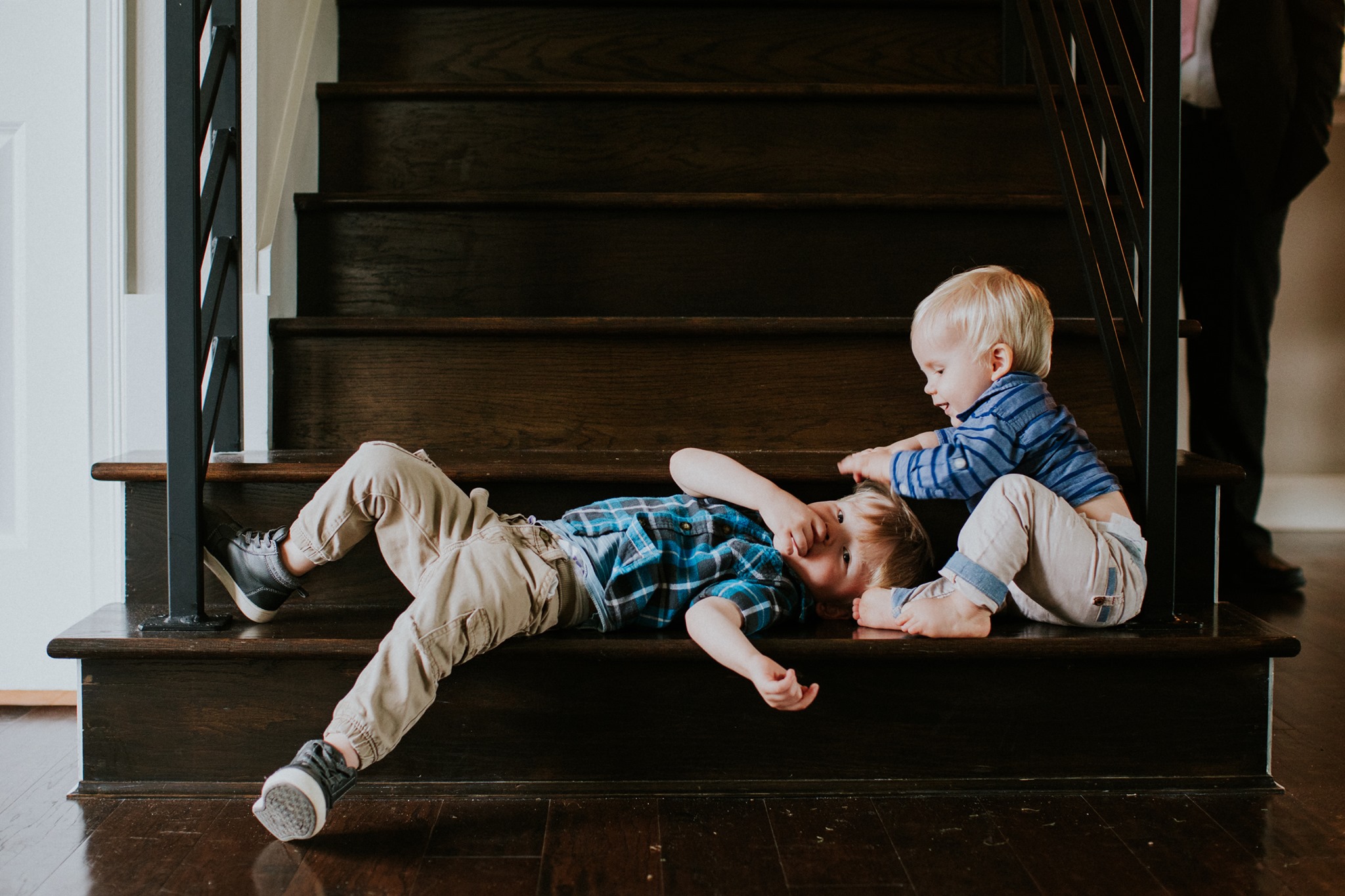
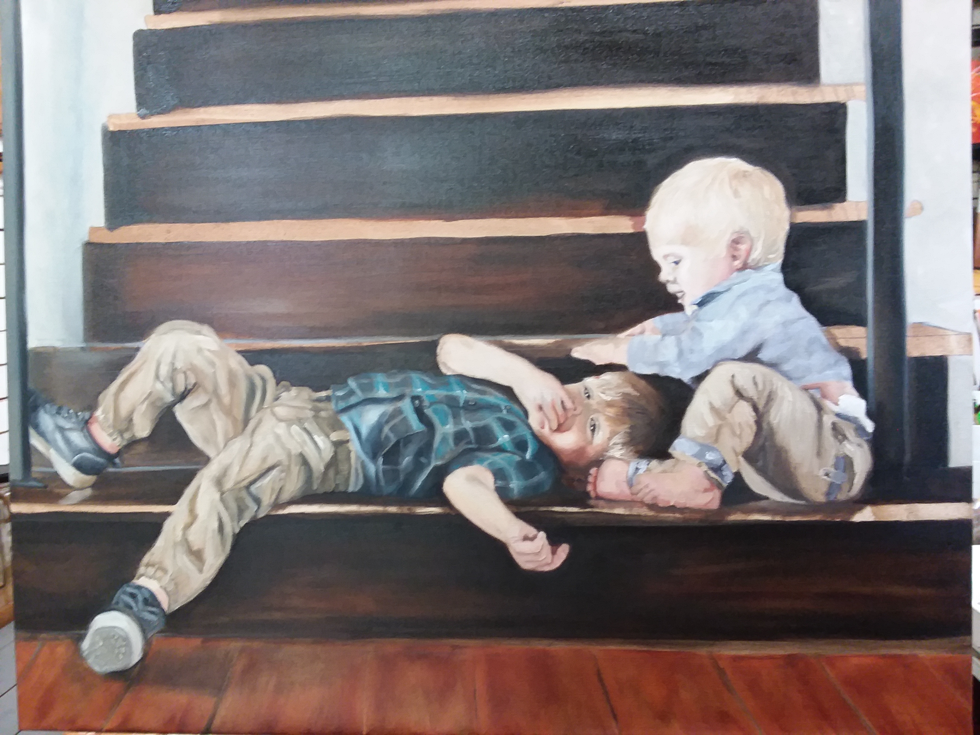
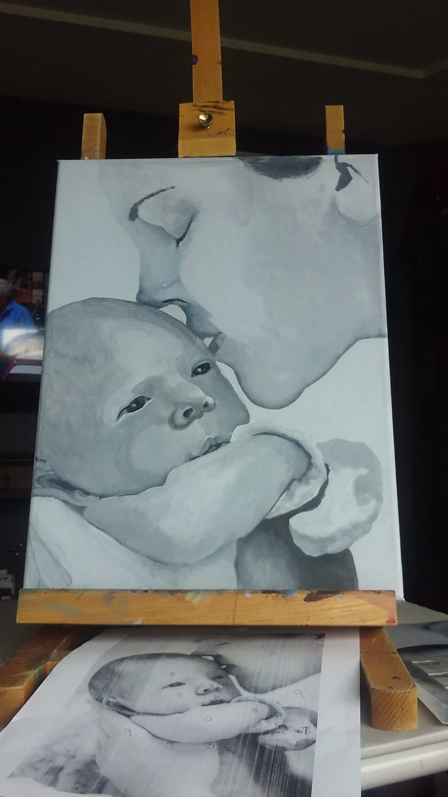
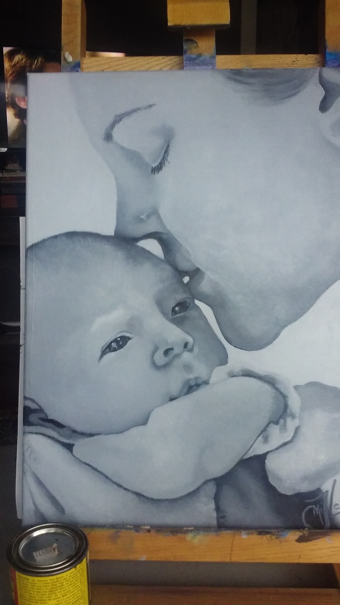
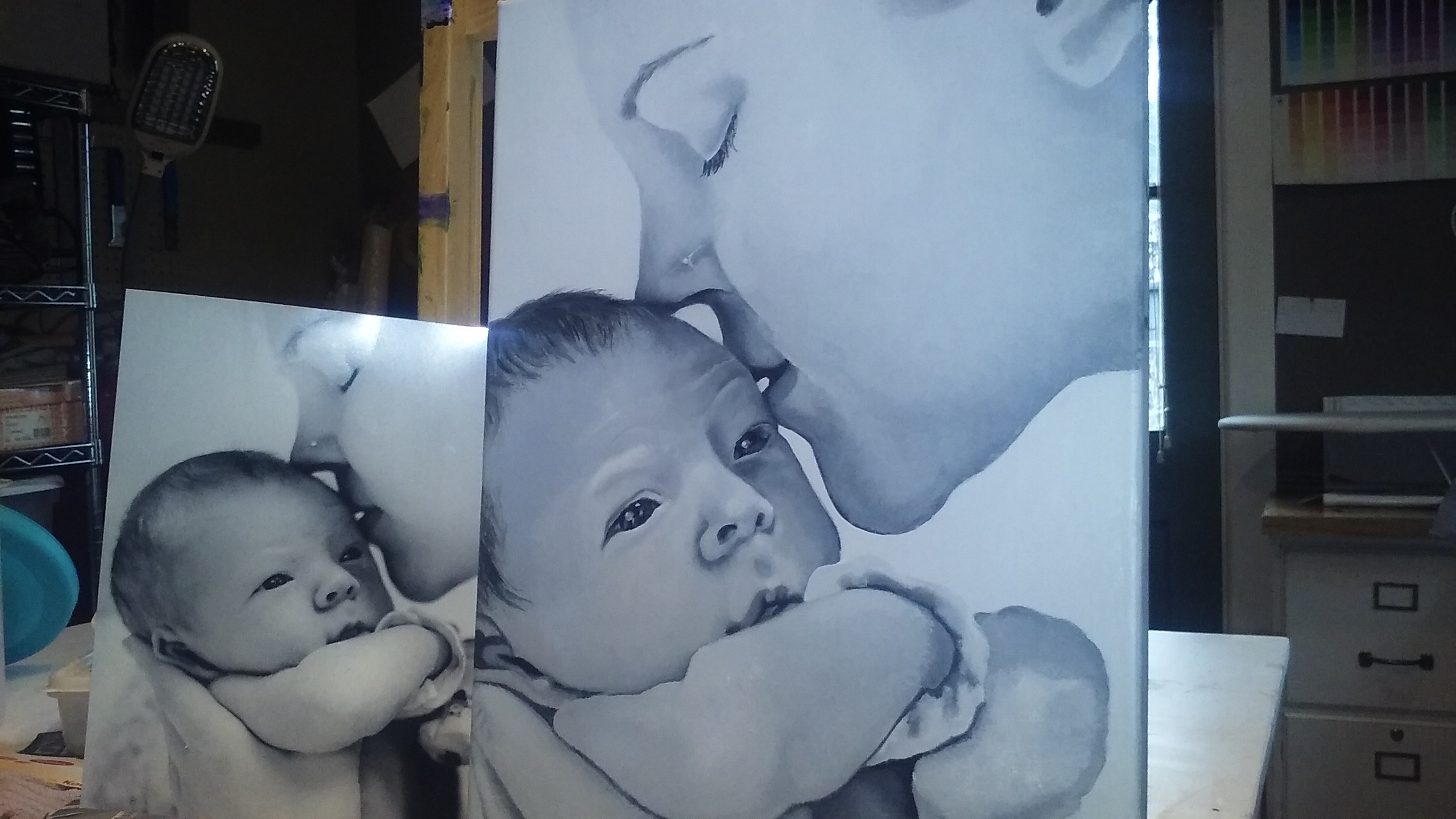
I loved this photo from the very first moment I saw it, as I do most of Naomi’s Photographs. This one is of my two grandsons so of course it had to become my next painting.

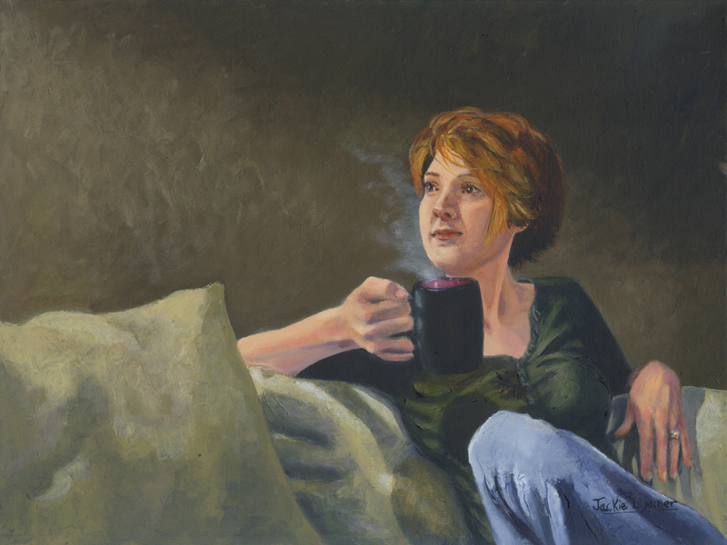
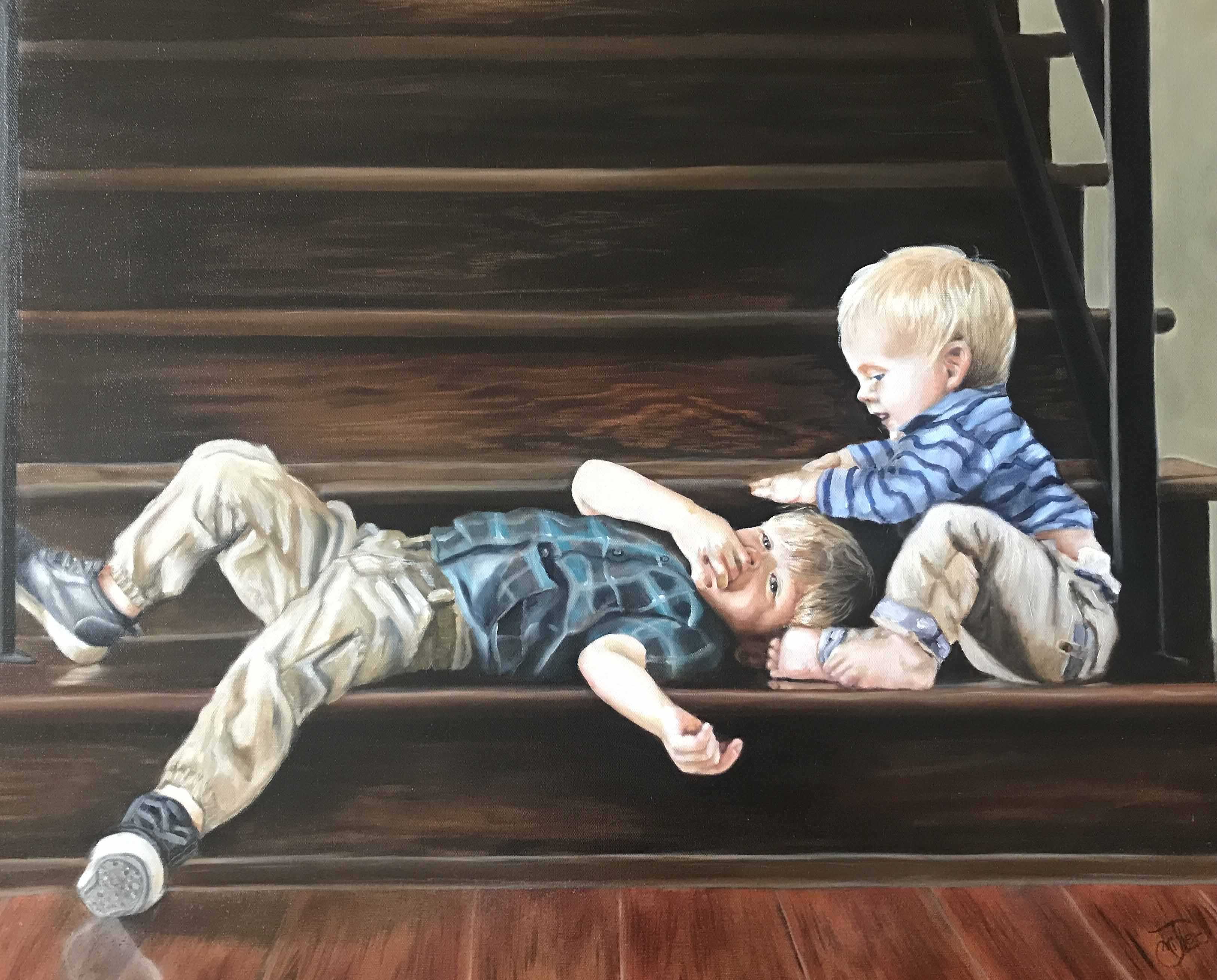
In this painting I was playing with focus. I wanted my detail on their little faces. Here I softly blended shadows and light to create more realistic features. But when it came to the clothing I painting with broad strokes because i wanted more to just indicate detail. When you stand back and look at this painting It looks almost like a photograph, But as you investigate closer you see the detail is a lot less clear in those clothing areas then in the faces.

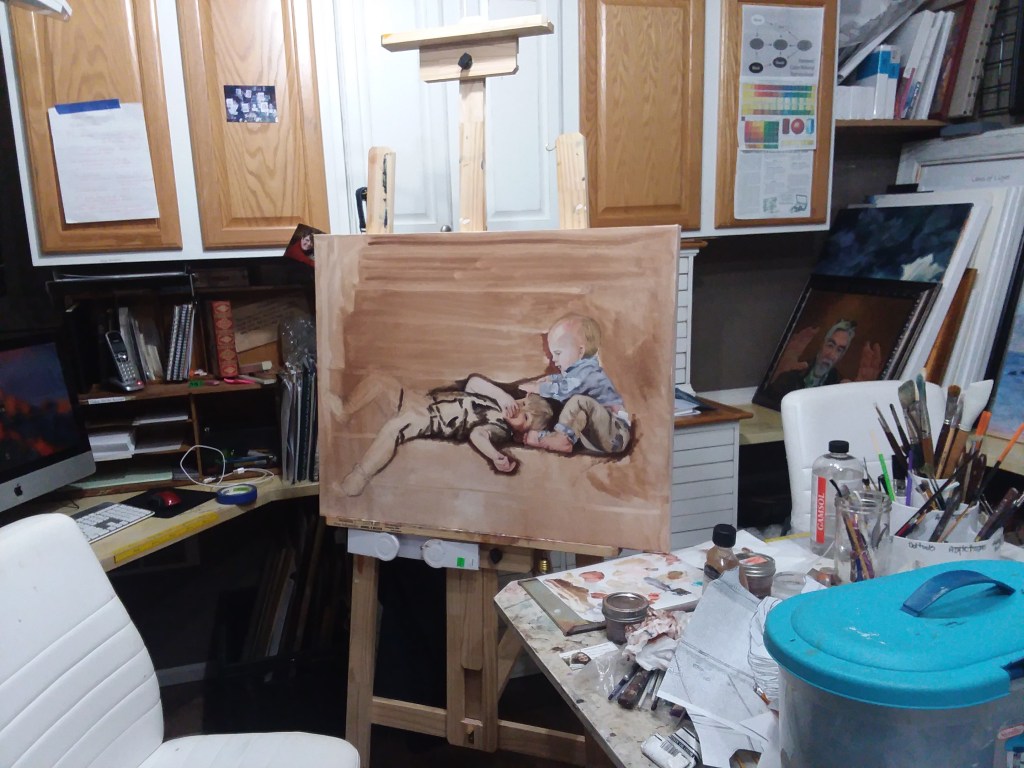
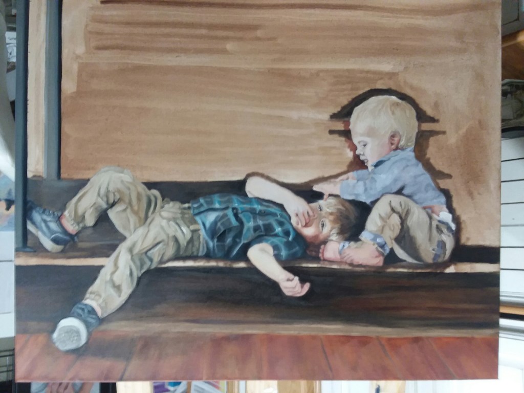
At first I painted from the reference just as it was. As I progressed I realized that something was wrong. Something was drawing my eyes away from the boys and that frustrated me. So I stopped painting on it for a couple of days to analyze it. It was troubling to me but I just couldn’t put my finger on the problem. The reference photo is so beautiful Just the way it is so what could be the problem?

A fellow artist/friend was over painting with me one day and so I asked her what she thought. She saw it right away.

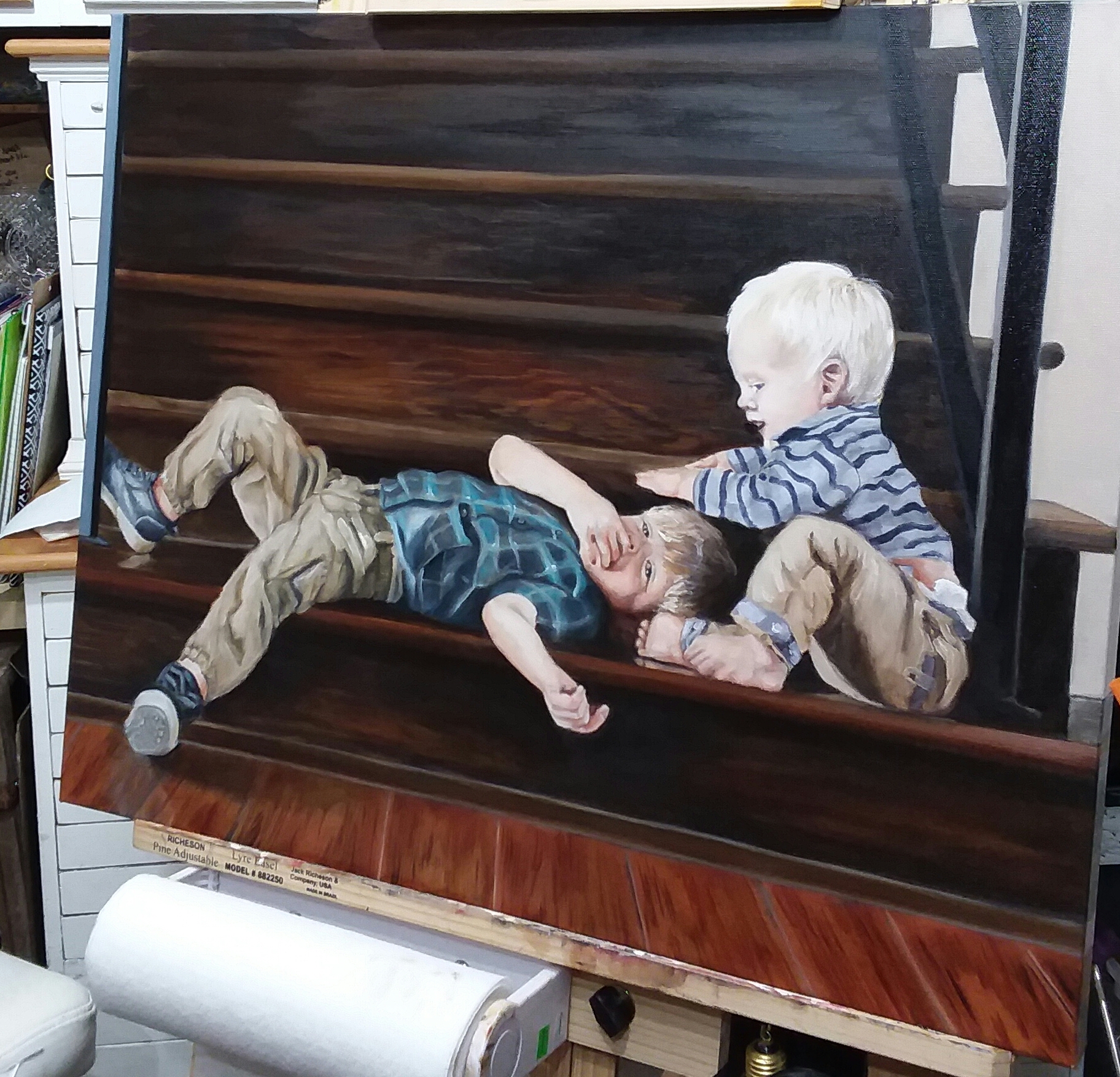
The problem was the large white spaces on either side of the stairs. You see the eye is naturally drawn to the point of greatest contrast. So the bright walls beside the dark stairs was a greater contrast than the boys skin against the stairs. She suggested that I modify the painting to remove the wall on the left, taking the steps all the way to the edge of the painting. This would draw the eye to the right side where I wanted it. Her suggestion was right on and it worked perfectly. You can slide the arrows on the images back and forth to see the difference it made.

I had so much fun working on the wood grain and the reflections in the shinny floor and steps. Also as you can see in the top right photo of the completed painting, I darkened the wall on the right so it would not compete with the boys as center of attention.

The thing I’ve learned most from this process over the years is that there is a big difference between what makes a good photograph and what translates well into a great painting. I love this reference photo. It’s perfect. I look at it and I see only my grandsons. But when translating it into a painting I had to create an allusion that would draw your attention to exactly where I wanted you to look.

So NOTE TO ARTISTS as an artist feel free to edit and change what is in front of you. Add and take away items to tell the story that you want told. If you are painting a landscape and there are electric lines in your view but you want to convey a cleaner more peaceful scene, take them out. Or if the is a great tree far away from a barn you want to paint. Move that tree to where it will tell your story best.

Please feel free comment below or contact me on the contact page if you have any questions about this blog or you would like to chat about having your own commissioned painting done.

Special Thanks for Reference Photo By Naomi Vacaro

Don’t forget to follow me on:

Newsletter

Subscribe to my email newsletter full of inspiring stories about my journey that continues.

Designed with WordPress.com

Grey in Gray

I have been absolutely slammed with wedding prep for my youngest son’s up coming marriage since returning from Florida to witness the birth of my eldest son’s first baby. Since I was there during the photo shoot (which included this amazing photo) I was quick to ask the photographer for permission to paint any of the photos she was about to take. With delight I was glad to hear her say “I was hoping you would ask that! Yes!”

View More: http://naomilynnphotography.pass.us/grey-thomas-miller

Photo by permission of naomilynn.com

Even as I sat on the sofa in my son’s home looking at the photos that the baby’s aunt Naomi took, I have been anticipating painting this photo. My son’s mother in law even offered to get me some art supplies so I could get started. But I chose to put aside my painting and just hold the baby for as long as I was able, before I had to head home to Oregon. SO even though I am slammed with wedding prep, I still snuck in a few hours here and there to paint this piece entitled Grey in Gray.

My students had asked me if I would teach a class on values once I returned home. So I thought what would be more appropriate then a gray values painting of baby Grey. (Even though I would have painting him for any excuse and will be for a long time I’m sure.)

So like always I started by taking my photo into photoshop and turning it into a black and white. Then I had a nice 8 x 10 glossy printed up and printed out a b&w photo copy as well.

0329171715

Using my values chart on the photo I then use the photo copy to write the corresponding value on the areas I had just checked. I did this twice as the photo was dark then I wanted the painting to be. The colored photo looked light and fresh but once I transferred it to b&w it was a little darker and I wanted a lighter feeling to the painting. So once all my basic values were charted I stepped them up 2 or 3 values and re-wrote out the corrected numbers on another photo copy.

To avoid any mistakes I then threw away the first photo copy with the original numbers on it. I did not want to take the chance of picking up the wrong copy and getting the values all mixed up on the painting. So then I blocked in the basic values on the different areas of the painting.

0323171622a

Being that this was a painting of a very soft baby, I wanted the canvas to be very soft as well without a lot of grain to the canvas left. So I primed it again with a layer of gray gesso before beginning the actual painting, then sanded it smooth. This was one of the smoothest paintings I have ever done. I really like having a smooth canvas and it gave the affect I wanted it to have. I did find myself painting and then taking a dry brush and dabbing at it to smooth out and blend colors. I really haven’t done that much before but it gave the skin a very natural soft texture that looks and feels very much like baby skin.

0325171232

Once I got all the areas of the painting blocked in, I let the painting dry for a couple of days. Then when I was able to squeeze in a little more time on him I started to put more detail and more subtle value changes in. This was so much fun as I saw with every stroke that my grandson’s face was taking shape. My daughter in Law’s face came together just as quickly and beautifuly. I love this part of the painting as you really do start getting a 3 D affect as you put in more and more values.

0325171758

So again, it was time to let the painting rest and dry.

NOTE: I used Golden Open white titanium paint for this painting and mixed it with the regular Golden brand acrylic paint. Acrylic paints dry very fast, but the new Golden OPEN paint will keep the dry time open for a much longer time, giving me the time I need to blend subtle value changes! Which I love.

But unfortunately, this paint reactivates up to and past 3 weeks. Which means that this morning when I went to put on the finishing touches like adding final highlights, instead of adding, it actually lifted the dry color off, creating and very blotchy look, Which I, well, lets put it this way “Hate is a strong word, but I really really , really don’t like you! ” I can’t help myself!  I burst into song lyrics at random points all the time. LOL! i would always rather laugh then cry and that was my option now. So I decided to sing!

So to fix this paint problem, I had to spray the painting with a clear spray varnish to seal off the underpainting, so that nothing would move once I started to put on the highlights and hair details. This worked great. I hope you like it! 😀

0329171652b

Thank you for taking your time to read about my work process. If you would like to check out my other pieces please click jackielittlemiller.com

Zebra Hearts

It’s valentines week! So I decided you post a blog featuring my most recent piece titled Zebra Hearts. This piece was done on scratch board and the painting with water color to give a little more detention.

This was a really fun project! I felt like a little kid again. I remember making our own scratch boards in 5th grade art class. This Scratch Board is a piece of masonite with a special ceramic coating and then a black ink scratch layer.

I started by tracing my sketch onto the solid black board with a white tracing paper. Since it was stripes I actually filled in the spaces with scribbled white so that I could keep the black and white stripes separated. It may not seem like it bout working with black and white stripes can get very confusing at times. This is the first scratch board I have done since 5th grade but I guess it is like riding a bike, because I never really forgot. I started by taking my x-acto knife and making hair like scratches on the surface of the white marked areas. I made sure to go in the direction of the hairs in my reference photo that I was granted permission to use by Photographer Sheilah Swanson who works at Wild Life Safari in Winston Oregon.

I made sure to make very light and fine lines in the areas where I wanted it to be lighter but not white. the zebra’s muzzle is one of those places. Hear I did directional scratches and some cross hatching.muzzle

The ears had longer hairs in them, and so I simply made longer intentional scratches so that the hair would look natural and lot like fence posts.ear

Adding a reflection in the eye was a little tricky as I really didn’t want a high light just a little bit of a haze to show the reflection of the sky. here again I did very fine scratches and cross hatching.eyes

When I had everything scratched in place I slowly used the flat of the x-acto knife and scraped the back ground away. I think it leaves a cool natural looking background. once that back ground was established I used water color paints to the white surface to give detention. I wasn’t sure it would accept the paint but it soaked right in and wouldn’t life out. so if you do this, build up your colors slowly as you wouldn’t get a second chance to lighten it  back up. Once the paint was dry, which was with in minutes, I scratched out the very white white highlights. As for signing it, well I simply scratched that isn too!signature

Final result is as 8″x 10″ Piece titled “Zebra Love” ready for framing. $250.00.

finished

If you are interested in purchasing this or any of my art just contact me at Jackielittlemiller.com

captivating_Miller_08g

Check out my other creations at

icon-etsy

Dream Dancer

leap-of-faith-8 
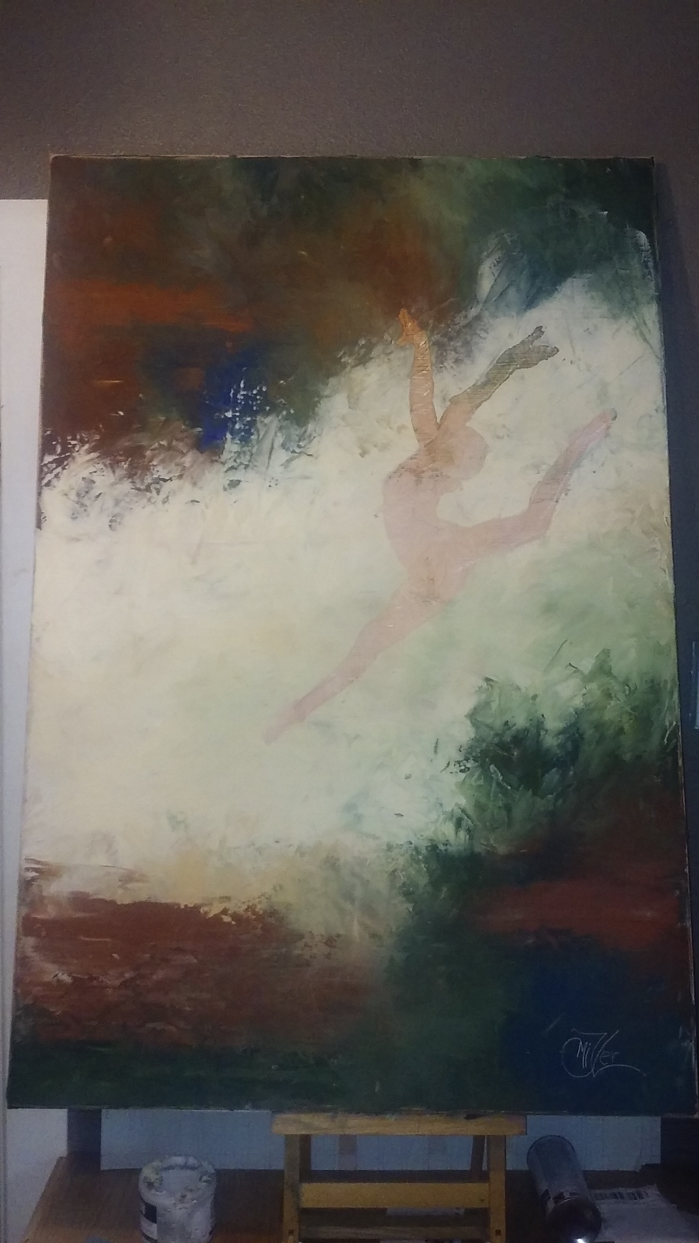
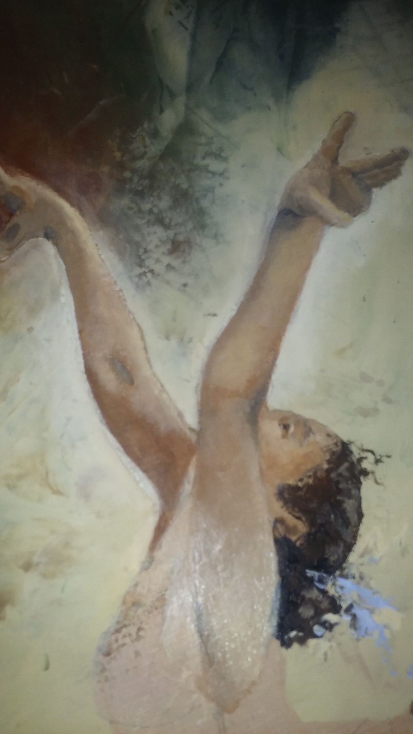
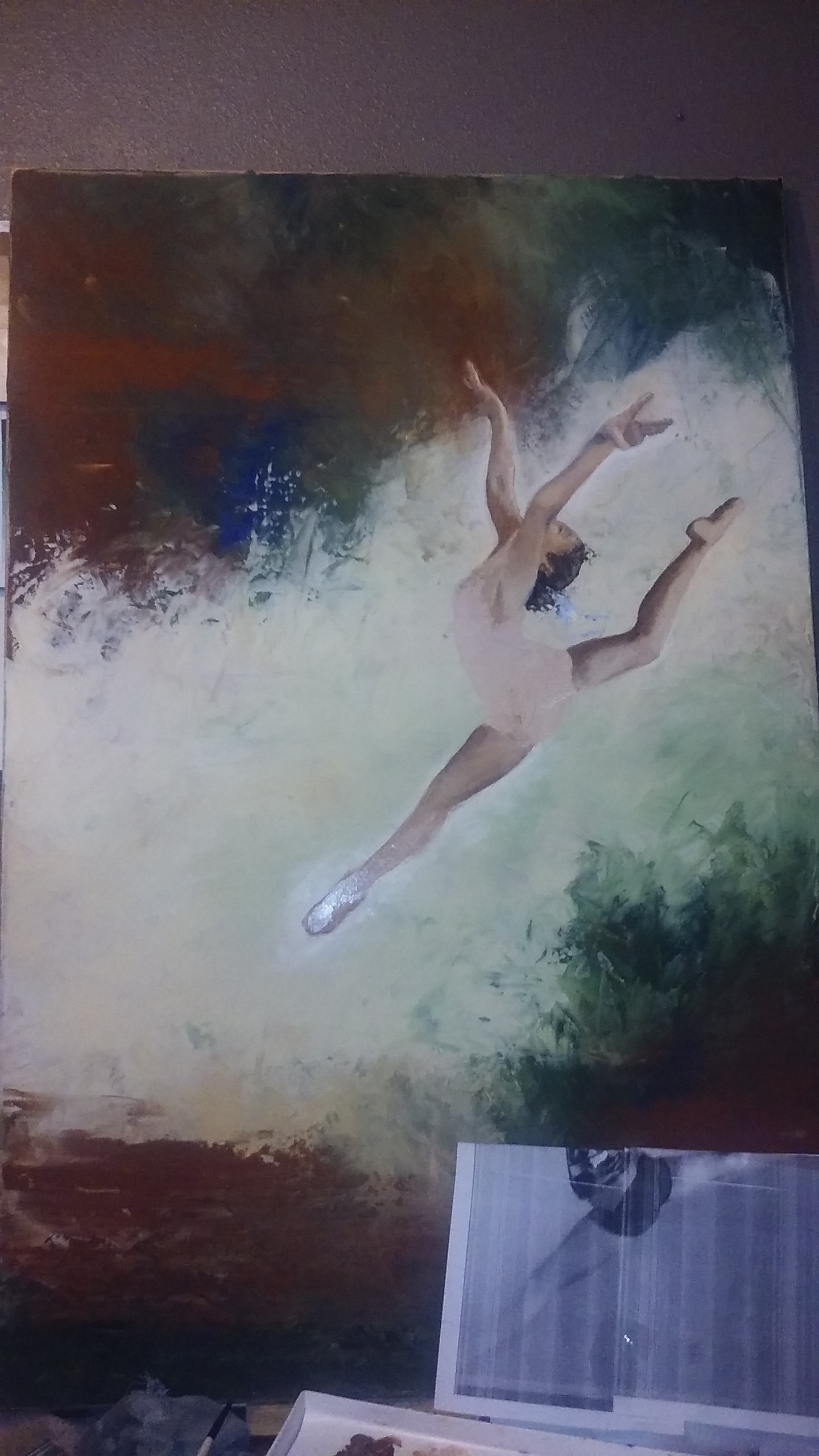
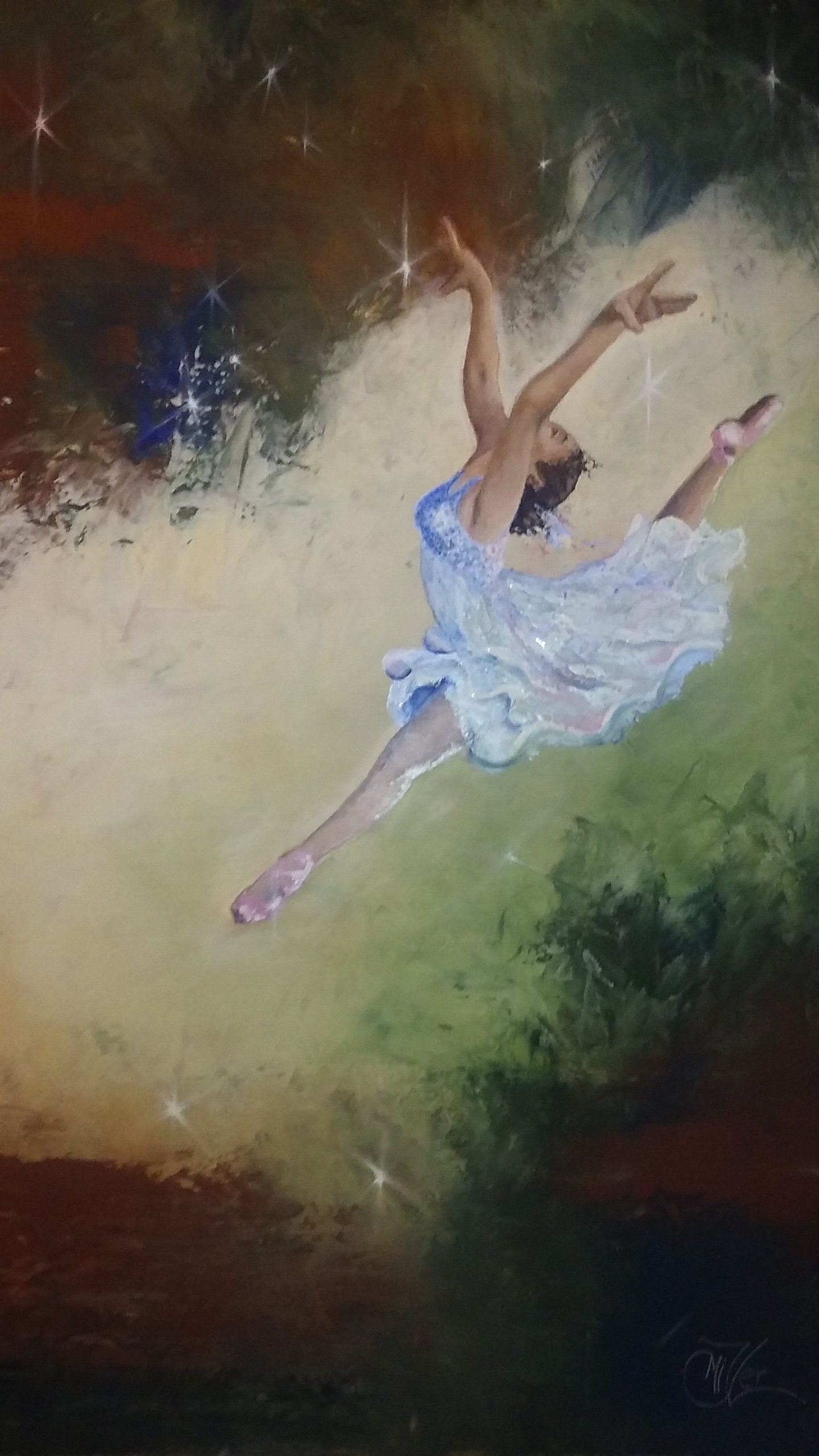
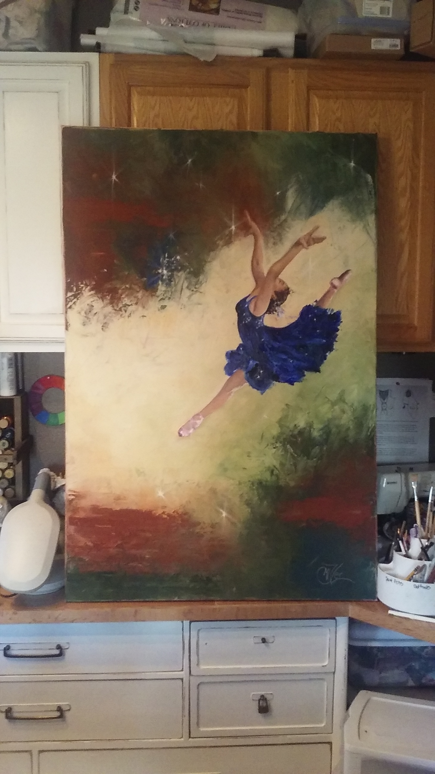
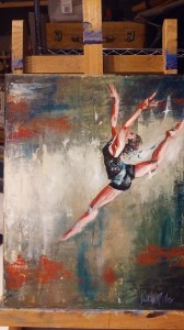
So you might remember my Leap of Faith painting from about a month ago. This one I did for my Granddaughter who was the subject of the reference photo I used. i really liked the way that painting turned out so I wanted to try it on a larger scale. So I pulled out a 4ft by 2.5ft canvas I have had laying around and started to sketch out the leaper in a larger format to fit the scale of the new canvas.

I wanted this piece to be mostly a knife painting so I added a texture paste medium to my paints so the knife strokes would hold their shape as they dried. Being that the canvas is very large it did take me the whole jar of medium! Wow! But I was very please with how the background turned out.

I had drawn the figure on the canvas before starting and did a base coat of a watered down burnt sienna just to take away the scariness of a blank white canvas. But as I was laying the thick background color paint on the canvas  I kind of lost the edges of the figure so I just decided to cover the whole canvas with background then redraw the subject later.

Once I had the background knifed in I started to rethink the whole waiting till it dried to draw in subject. After all if I wait then the subject will have weird texture in strange places making it not read right. So While it was still tacky I placed the drawing of the dancer on top and intended to just use the indent of the pencil edge to make a trace line, not using any carbon paper as to leave a dark mark. I actually thought that i=this would just leave and slight indent in the paint giving me enough information as to where to place the subject. But when I pulled the paper off the outline of the subject came with it leaving a rough edge.0118171501

This is one of those things that Bob Ross would call a happy accident. I loved the roughness of the edge! In fact I considered leaving the painting as it was, but quickly changed my mind as I still wanted to work more on her. so I scraped out the inside of the outline so that I could start painting the gymnast.

0119170900a

Here you can see the rough edges around the subject. I think it adds interest to the piece. Anyway as I finished up with the skin tones I realized that this was not a gymnast but a dancer. I’m the artist I can make these kind of decisions! LOL! She needed a pretty flowing dress and some point shoes. What do you think?

large-leap

So I started painting her dress. I liked the blue from the background as there was just a touch of it. So I lightened it and made a pretty pastel chiffon dress. This I did totally with the edge of the paint knife and lots of paint. I was very pleased with how it turned out0120171925a

But the next morning I was rethinking it. Though I still loved the dress it just didn’t make the dancer pop! I mean I loved the skin tones and how rich it felt, but the dress kinda made her look, well unfinished, flat, she just didn’t make the statement I wanted her to make.

So I took the photo of her into photo shop and did a quick dress color change on her. Now I am not skilled in photo shop at all and there was probably a much better way of doing it then what I did , but this worked. So I pulled colors from the background and laid in the color into the dress.

After showing these choices to a couple of artist friends of mine I decided on the dark blue dress. I just felt if gave the feeling I wanted and the pop that it needed. My daughter even suggested that I could put some sparkle stars in her dress echoing the galaxy feel from around her. SO I did. And Here she is finished.

Dream Dancer

31″ x 47″ x 1″

Acrylic on Gallery wrapped canvas

$1,000.00

0127171207b

Once I get a good photo of her so prints I will finish her with a couple of layers of gloss varnish. This is also My first piece with my new signature that you will be seeing on all my works from this point out.!

0131171033

God bless your day and Thank you again for following my Works In Progress!

captivating_Miller_08g

Quiet Time

It seams like I have gone from a year long dry spell to an oasis of ideas. Working on several pieces at a time. This painting was so much fun and yet so much of a challenge. I wanted to do her with a loose brush stroke to give it a relaxed feeling as the pose is of my daughter Jenny relaxing and with me and a cup of hot chocolate. As I often do as I am talking to someone I think of how I would mix the colors to paint her face or the color of reflected light that catches her chin. Then I was struck by her relaxed pose and did the mom thing and pulled out my phone and snapped a few quick shots before she realized I was doing so.

img_0758

SO of course I started with a sketch and traced it onto my canvas as always. I worked on blocking in the back ground and then started on the face. I know I should do other things first but I am like a kid in a candy store when it comes to painting faces. I just can’t wait to get at it. This painting proved to me a true test as I lost her face completely a hundred times. well maybe not actually 100 but close.

When painting faces especially portraits that  you want to look like a specific person, the larger the painting the easier it is to get those features right. This painting is only 12″ x 16″ So her face is only about 2″ big. this makes getting subtle value changes and warm light cool light areas a little more difficult. Plus at this size if you facial features are off by a hair width you have a different person interlay.

Also I had a hard time getting her eyes to look up like in the photo. This doesn’t seem to be that bad but even if the eyes are the correct shape it changes the mood of the subject. I wanted the upward glance because it was happy and hopeful. But I kept getting the straight ahead gaze which made her look sad or even one time mad, which was not what I wanted at all. Because it isn’t who my Jenny is. She is fun loving and cheerful and always thinking of new ideas. That is the feeling I wanted to capture.

This slideshow requires JavaScript.

Here is a quick run through of all the faces of Jenny! LOL! I know she is blue for a while, It was an underpainting that eventually got painted over also. These are just a few of the many faces. Over the weeks of working on her I would get so frustrated paint over the face and start again, working on something else on the painting until the face painted area was dry and ready to work again. This actually worked great because I had a lot of time to spend on perfecting the other area of the painting that I might not have taken if the face turned out great the first time.

Here you can see the purple underpainting of the shadows on the sofa and pillows which eventually got glazed a lovely sand color. It makes it a little hard to judge if you are getting things right when you paint things in colors that they are not going to be, but it is truly the values that matter the most so if they are right everything will turn out fine in the end.

It can be hard sometimes as I post my works in progress as I work on them. Sometimes that pressure makes me work harder to get it right, other times it makes me wish I would have kept thins one to myself! LOL! But even with all the frustrations I am totally excited about how she turned out.

fb-scan-jenny

Thank you so much for following my Works in Progress! You support and encouragement are so appreciated!

captivating_Miller_08g

Check out my online Portfolio @ Jackielittlemiller.com

Cat Fight

Wow! I just found out and I am so excited to tell you all that my new Painting “Cat Fight” has won in the Advanced Category on the Facebook CPAL Featured Artist Contest for the month of January. This is such a great honor, as it is an international group of Color Pencil Artists from beginners to experts. The contest is voted on by the members and there is nothing quite like being recognized by a group of your peers. This means that “Cat Fight” will be featured on the facebook banner for a month, plus It will be published in an upcoming issue of the magazine Color Pencil.

Story of creating Cat Fight

My friend Sheilah Forbes Swanson has an awesome job out at Wild Life Safari in Winston Oregon; where she gets to take photos of the animals up close and in person. She has given me the awesome privilege of being able to use her photos for reference for my art. As soon as I saw this photo I knew I needed to paint these girls.

tigers3-play-edit-crop

First I prepped my canvas with Art Spectrum fine tooth colourfix primer on the unstretched  canvas which I had taped to a board. Then left this to completely dry.

Then I started By by graphing out the photo so that I could increase the picture in size.Then I can trace that larger image onto any surface I want to paint or use my colored pencil using a large piece of carbon paper.

I had done a tiger face earlier in colored pencil in canvas I really liked how it had turned out.So I decided to try that again to make a series.Then I set forth to trace the Cat Fight onto a piece of canvas.

I love eyes! I always start with the eyes, kinda like eating desert before dinner. I just can’t help myself. My reasoning is that if the eyes are not right nothing else matters. This may not actually be true, but it is true to me!

1-d-face-with-ref

Here I basically blocked in the face in the color tones and values, then worked them down into the texture of the canvas using odorless mineral spirits on the colored pencil to melt it down into all the diets of the canvas so there wouldn’t be white spots anywhere. This I did through out the first layers of the tigers and background.

h-tiger2

Bit by bit I did the same process on the whole canvas surface, blocking in the underpainting. I then sprayed the entire piece with a textured fixative by Brush and Pencil. This is an awesome product and it made it possible for me to put lighter colors on top of the dark ones. You still have to be mindful to leave light spots light to retain the light in the painting, but it makes it easier to lighten things back up a bit.

Remember that when ever you are painting or using pencils to draw an animal with fur that you need to make you r pencil/brush stroke in the direction of the fur. You must constantly refer to your photo because underlying muscle and bone cause the hairs to shift position as they proceed down the body/ face…i-more-t2

Here I start refining the face and adding the detail. I just wanted to stay on the face and not finish the rest. Her eyes kept calling me back to them. I had to stop and step back from this piece for a while at this point because some of my values had gotten off kilter. Some things needed to be punched much deeper, others needed to be lightened up. at this point everything I do on the cats is done with hair strokes in the proper direction.

NOTE: don’t fence post your hairs. Hair can aim in a general direction without everything going in exactly the same direction.

z-finished

Once the values were corrected, and background filled in with shadows punched just a little darker I was done. I could have gone into more detail on the forelegs but I felt that I wanted the focus to be her eyes anyway so I left the rest less detailed.

To give the canvas I nice protective surface I sprayed it with 4 layers of Golden’s Archival varnish with UVLS protection. This you can get in a Gloss or satin finish. I prefer the Gloss, but us a satin until I get it scanned or photographed so there is no glare.

captivating_Miller_08g                                   See My online Portfolio at jackielittlemiller.com