Last Goodbye

This is my second painting in the Ecclesiastes 3 series, to everything there is a season. I have been a portrait artist for years and love the human expression. Driven by a desire to push myself past faces, I started thinking about doing a series of paintings on hands. Then I thought maybe hands and feet, and I came to the conclusion that I just wanted to be able to paint expressive emotion without the aid of facial expression. So I had all these possible ides running around in my head, day and night. especially at night. I tend to do all my best thinking just before I go off to sleep. After the process of painting “A Time to Mourn” the series was set in my mind. But this painting was of the full body and was a dancer. So then I’m asking myself questions like, if this one is of a dance, does the whole series need to be represented in dance? Do I use the whole body in all the paintings: Or can I still go with just hands, or hands and feet? So many conflicting ideas overwhelmed my thoughts. Then the answer came to me.

In December of last year when my sister was passing away,  I sat in the room with her holding her hand, as she was taking, what I knew were some of, her last breaths, I looked down at my hands holding and caressing hers. The artist in me wanted to capture this moment forever with a photo of our hands touching for the last time this side of heaven.The rational side of me, how ever, talked me out of it saying that it would be crass and insensitive of me. For several months afterword I mourned that decision, as my sister and I were so very close and her hands and my hands worked along side each other so many times. She was like an extension of me and I of her.

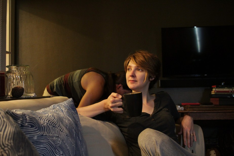
One day as I sat visiting a friend who had just recently lost a dear life long friend, she was expressing her feelings as she and another friend sat saying their last goodbyes to their failing friend. She looked at me and said, I have something I want you to see. She then opened photos on her phone and showed me this beautiful photo of the three friends holding hands. She expressed to me how she had apprehensions about taking the photo, and had almost talked herself out of it, but her other friend encouraged her to go ahead and take it. As I looked down on this photo, I was taken back to that precious unforgettable moment with my beloved sister. I instantly asked permission to paint this photo, and was graciously granted permission, with my friend saying, “Maybe it was meant to be shown to you!” And I think she was right.43672923_560139704412003_7099662553256558592_n

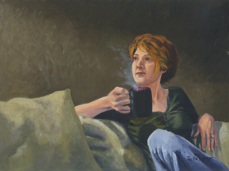
So I started with a sketch up. I changed the angle of the hand on the left as I felt it was leading the eye off the page coming in directly from the left. instead I angled it from the bottom left corner to lead the eye in to exactly where I wanted it to land. I also enlarged the drawing to fit the size of canvas I wanted to use. I did a little shading with my pencil to give myself indications of shape and values needed. I then started by blocking in the sheets and hand furthest underneath it all, working myself to the top hand.

working in acrylics has always given me a challenge full of frustration. It dries so quickly and just doesn’t give me the time I need the for subtle blending needed to paint skin the way I would like. I admit I am a blend-o-maniac! There I said it! Another frustration that was getting the better of me was that acrylics tend to dry darker then the wet paint. sometimes 2 or 3 shades darker. Usually I would be able to press on through and get it done anyway, but this year has been rough when it comes to how much patience and to be honest how much energy and even desire to paint. So any frustration at all will shut me down in minutes. So again progress on this painting stopped for about a month.


I know it’s normal, as I am grieving, to be frustrated and lose focus easily, but it is also very stressful. I have the creative ideas constantly flooding my mind and I need to be able to express them or I kinds get a little crazy. It’s like therapy to me to paint through my pain and emotions. Anyway, I started entertaining the thought of trying to paint with oils again. I had stopped because the fumes would trigger my migraines, and nobody can be creative with a migraine, right? So i did a bunch of research and purchased oil paints with just pigment and oil, and got an odorless solvent which I use very sparingly. I was so blessed to find that they did not trigger migraines and the blend like butter. I am In love!

Once I started painting with the oils I felt like a bird set free from her cage. These paints are wonderful. I am in blend heaven. And I can paint for days with the same pile of paints before they dry up on me. This is going to take me a while to get used to as the canvas stays wet for days too. But this is both good and bad. Good because I can continue to blend and get those subtle blends I want, but bad because I can still blend and get those blends I don’t want! LOL!

Back to the painting itself. In the photo my friend is wearing a silver bracelet that she wears all the time as it is very special to her. I really wanted to get that bracelet into the painting. But as I started blocking it in I realized that my eye was being constantly drawn to the bracelet more then to the hands clasping, where I wanted the attention to be. So I made the hard decision for the sake of the composition to remove it.

Once that decision was executed and the arm was finished being painted, I went over my darks with a couple layers of glaze to deepen the wrinkle, in the hands as well as the sheets. added a few age spots, and glazed in some red to the arthritic joins in the main hand. Showing the painting to my friend who took the photo she says “I love the painting but it makes me cry every time I see it.” This is the highest complement ever! and I have to agree, it makes me cry too from my own precious Last goodbye with my sister. But it’s not the ugly cry that it used to be, it is the cry of being blessed by a women I will never fully let go of!


fbsignature“Last Goodbye” From the Ecc.3 series

14″x18″ oils on canvas


Dream Dancer

leap-of-faith-8 
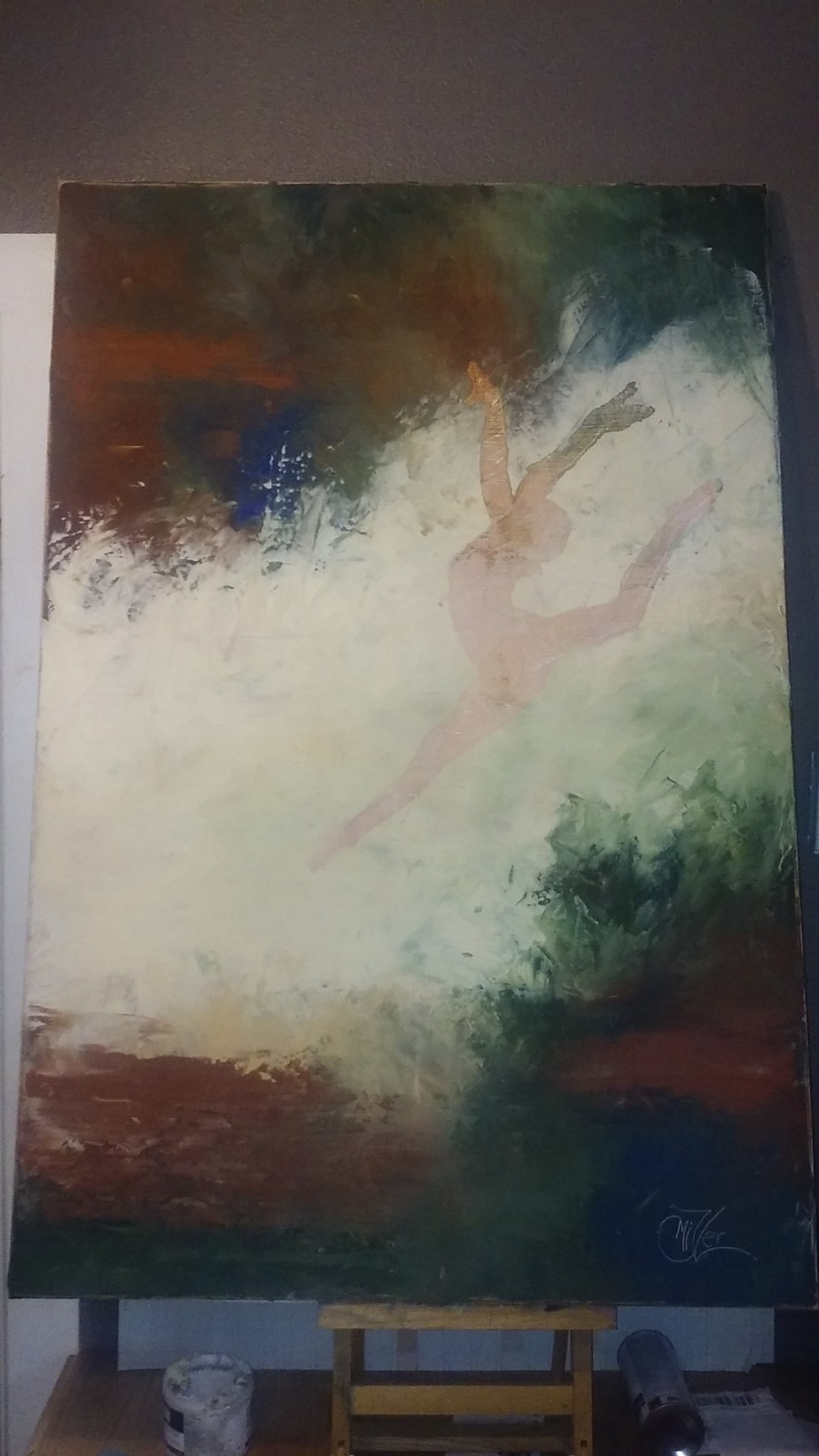
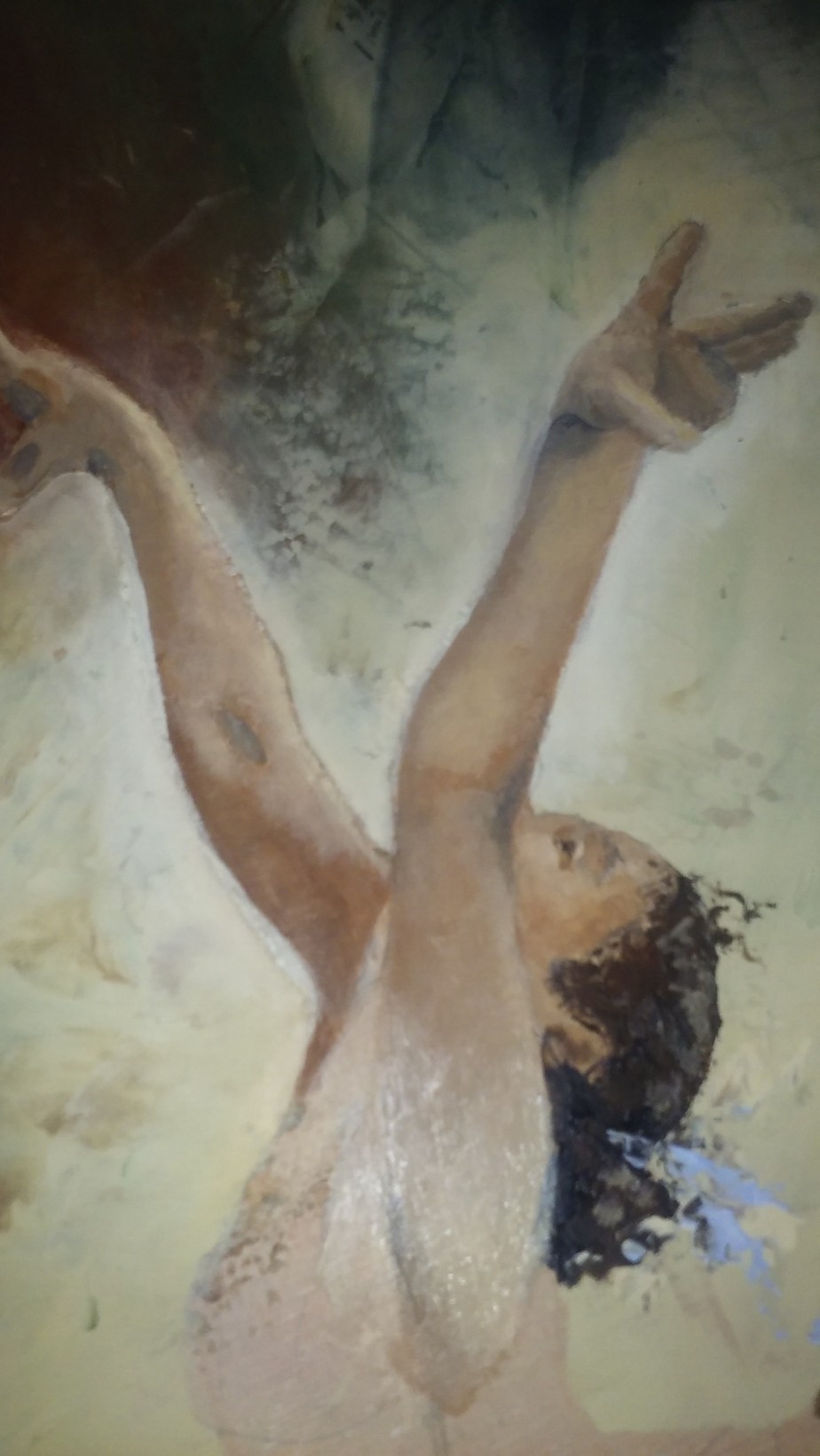
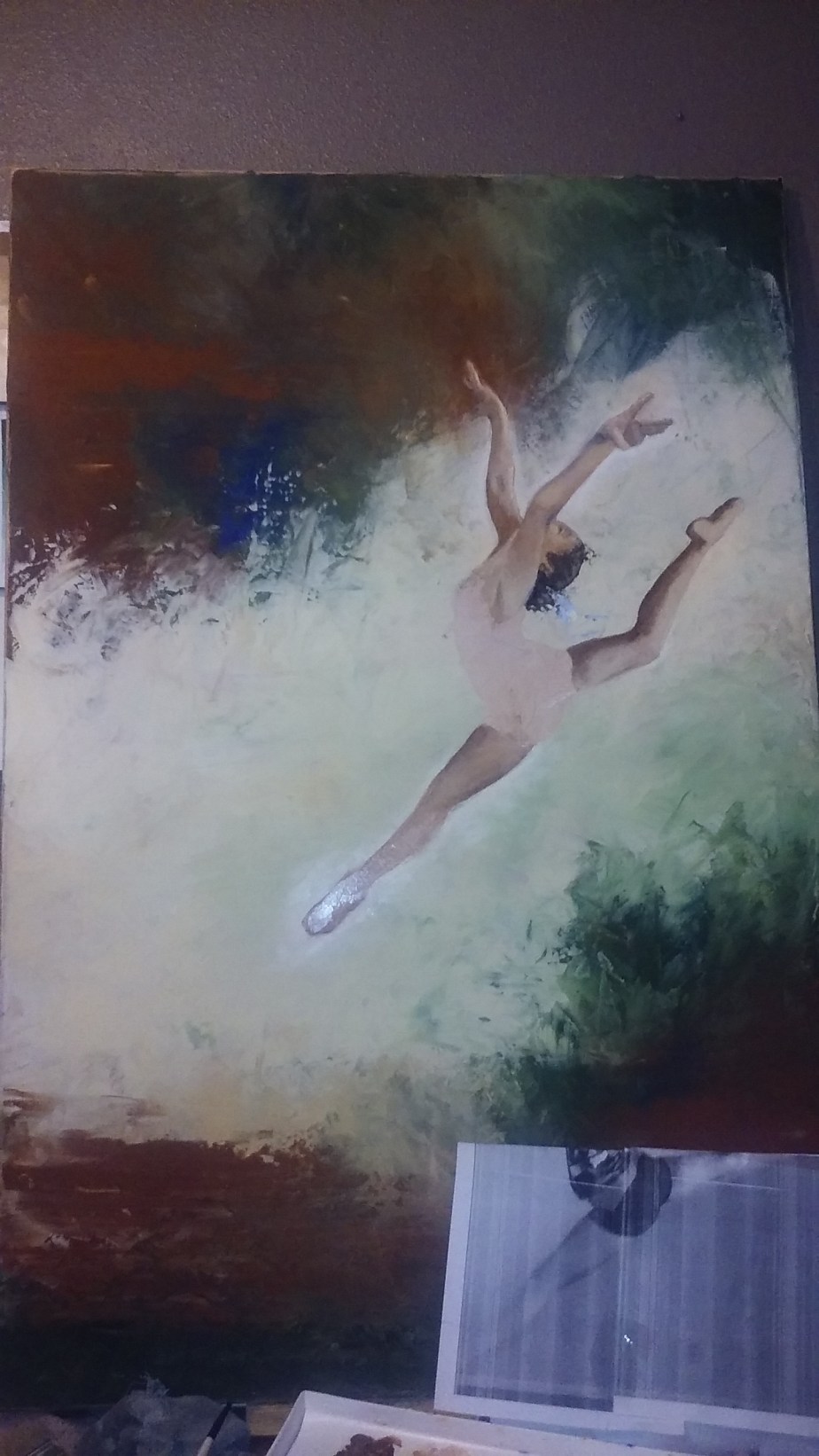
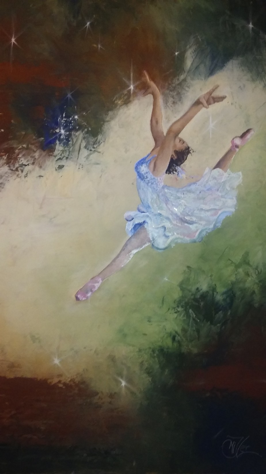
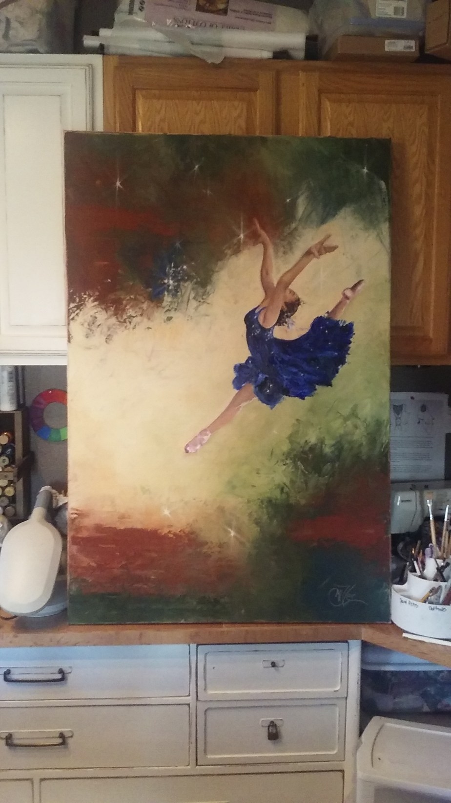
So you might remember my Leap of Faith painting from about a month ago. This one I did for my Granddaughter who was the subject of the reference photo I used. i really liked the way that painting turned out so I wanted to try it on a larger scale. So I pulled out a 4ft by 2.5ft canvas I have had laying around and started to sketch out the leaper in a larger format to fit the scale of the new canvas.

I wanted this piece to be mostly a knife painting so I added a texture paste medium to my paints so the knife strokes would hold their shape as they dried. Being that the canvas is very large it did take me the whole jar of medium! Wow! But I was very please with how the background turned out.

I had drawn the figure on the canvas before starting and did a base coat of a watered down burnt sienna just to take away the scariness of a blank white canvas. But as I was laying the thick background color paint on the canvas  I kind of lost the edges of the figure so I just decided to cover the whole canvas with background then redraw the subject later.

Once I had the background knifed in I started to rethink the whole waiting till it dried to draw in subject. After all if I wait then the subject will have weird texture in strange places making it not read right. So While it was still tacky I placed the drawing of the dancer on top and intended to just use the indent of the pencil edge to make a trace line, not using any carbon paper as to leave a dark mark. I actually thought that i=this would just leave and slight indent in the paint giving me enough information as to where to place the subject. But when I pulled the paper off the outline of the subject came with it leaving a rough edge.0118171501

This is one of those things that Bob Ross would call a happy accident. I loved the roughness of the edge! In fact I considered leaving the painting as it was, but quickly changed my mind as I still wanted to work more on her. so I scraped out the inside of the outline so that I could start painting the gymnast.

0119170900a

Here you can see the rough edges around the subject. I think it adds interest to the piece. Anyway as I finished up with the skin tones I realized that this was not a gymnast but a dancer. I’m the artist I can make these kind of decisions! LOL! She needed a pretty flowing dress and some point shoes. What do you think?

large-leap

So I started painting her dress. I liked the blue from the background as there was just a touch of it. So I lightened it and made a pretty pastel chiffon dress. This I did totally with the edge of the paint knife and lots of paint. I was very pleased with how it turned out0120171925a

But the next morning I was rethinking it. Though I still loved the dress it just didn’t make the dancer pop! I mean I loved the skin tones and how rich it felt, but the dress kinda made her look, well unfinished, flat, she just didn’t make the statement I wanted her to make.

So I took the photo of her into photo shop and did a quick dress color change on her. Now I am not skilled in photo shop at all and there was probably a much better way of doing it then what I did , but this worked. So I pulled colors from the background and laid in the color into the dress.

After showing these choices to a couple of artist friends of mine I decided on the dark blue dress. I just felt if gave the feeling I wanted and the pop that it needed. My daughter even suggested that I could put some sparkle stars in her dress echoing the galaxy feel from around her. SO I did. And Here she is finished.

Dream Dancer

31″ x 47″ x 1″

Acrylic on Gallery wrapped canvas

$1,000.00

0127171207b

Once I get a good photo of her so prints I will finish her with a couple of layers of gloss varnish. This is also My first piece with my new signature that you will be seeing on all my works from this point out.!

0131171033

God bless your day and Thank you again for following my Works In Progress!

captivating_Miller_08g

Quiet Time

It seams like I have gone from a year long dry spell to an oasis of ideas. Working on several pieces at a time. This painting was so much fun and yet so much of a challenge. I wanted to do her with a loose brush stroke to give it a relaxed feeling as the pose is of my daughter Jenny relaxing and with me and a cup of hot chocolate. As I often do as I am talking to someone I think of how I would mix the colors to paint her face or the color of reflected light that catches her chin. Then I was struck by her relaxed pose and did the mom thing and pulled out my phone and snapped a few quick shots before she realized I was doing so.

img_0758

SO of course I started with a sketch and traced it onto my canvas as always. I worked on blocking in the back ground and then started on the face. I know I should do other things first but I am like a kid in a candy store when it comes to painting faces. I just can’t wait to get at it. This painting proved to me a true test as I lost her face completely a hundred times. well maybe not actually 100 but close.

When painting faces especially portraits that  you want to look like a specific person, the larger the painting the easier it is to get those features right. This painting is only 12″ x 16″ So her face is only about 2″ big. this makes getting subtle value changes and warm light cool light areas a little more difficult. Plus at this size if you facial features are off by a hair width you have a different person interlay.

Also I had a hard time getting her eyes to look up like in the photo. This doesn’t seem to be that bad but even if the eyes are the correct shape it changes the mood of the subject. I wanted the upward glance because it was happy and hopeful. But I kept getting the straight ahead gaze which made her look sad or even one time mad, which was not what I wanted at all. Because it isn’t who my Jenny is. She is fun loving and cheerful and always thinking of new ideas. That is the feeling I wanted to capture.

This slideshow requires JavaScript.

Here is a quick run through of all the faces of Jenny! LOL! I know she is blue for a while, It was an underpainting that eventually got painted over also. These are just a few of the many faces. Over the weeks of working on her I would get so frustrated paint over the face and start again, working on something else on the painting until the face painted area was dry and ready to work again. This actually worked great because I had a lot of time to spend on perfecting the other area of the painting that I might not have taken if the face turned out great the first time.

Here you can see the purple underpainting of the shadows on the sofa and pillows which eventually got glazed a lovely sand color. It makes it a little hard to judge if you are getting things right when you paint things in colors that they are not going to be, but it is truly the values that matter the most so if they are right everything will turn out fine in the end.

It can be hard sometimes as I post my works in progress as I work on them. Sometimes that pressure makes me work harder to get it right, other times it makes me wish I would have kept thins one to myself! LOL! But even with all the frustrations I am totally excited about how she turned out.

fb-scan-jenny

Thank you so much for following my Works in Progress! You support and encouragement are so appreciated!

captivating_Miller_08g

Check out my online Portfolio @ Jackielittlemiller.com

Cat Fight

Wow! I just found out and I am so excited to tell you all that my new Painting “Cat Fight” has won in the Advanced Category on the Facebook CPAL Featured Artist Contest for the month of January. This is such a great honor, as it is an international group of Color Pencil Artists from beginners to experts. The contest is voted on by the members and there is nothing quite like being recognized by a group of your peers. This means that “Cat Fight” will be featured on the facebook banner for a month, plus It will be published in an upcoming issue of the magazine Color Pencil.

Story of creating Cat Fight

My friend Sheilah Forbes Swanson has an awesome job out at Wild Life Safari in Winston Oregon; where she gets to take photos of the animals up close and in person. She has given me the awesome privilege of being able to use her photos for reference for my art. As soon as I saw this photo I knew I needed to paint these girls.

tigers3-play-edit-crop

First I prepped my canvas with Art Spectrum fine tooth colourfix primer on the unstretched  canvas which I had taped to a board. Then left this to completely dry.

Then I started By by graphing out the photo so that I could increase the picture in size.Then I can trace that larger image onto any surface I want to paint or use my colored pencil using a large piece of carbon paper.

I had done a tiger face earlier in colored pencil in canvas I really liked how it had turned out.So I decided to try that again to make a series.Then I set forth to trace the Cat Fight onto a piece of canvas.

I love eyes! I always start with the eyes, kinda like eating desert before dinner. I just can’t help myself. My reasoning is that if the eyes are not right nothing else matters. This may not actually be true, but it is true to me!

1-d-face-with-ref

Here I basically blocked in the face in the color tones and values, then worked them down into the texture of the canvas using odorless mineral spirits on the colored pencil to melt it down into all the diets of the canvas so there wouldn’t be white spots anywhere. This I did through out the first layers of the tigers and background.

h-tiger2

Bit by bit I did the same process on the whole canvas surface, blocking in the underpainting. I then sprayed the entire piece with a textured fixative by Brush and Pencil. This is an awesome product and it made it possible for me to put lighter colors on top of the dark ones. You still have to be mindful to leave light spots light to retain the light in the painting, but it makes it easier to lighten things back up a bit.

Remember that when ever you are painting or using pencils to draw an animal with fur that you need to make you r pencil/brush stroke in the direction of the fur. You must constantly refer to your photo because underlying muscle and bone cause the hairs to shift position as they proceed down the body/ face…i-more-t2

Here I start refining the face and adding the detail. I just wanted to stay on the face and not finish the rest. Her eyes kept calling me back to them. I had to stop and step back from this piece for a while at this point because some of my values had gotten off kilter. Some things needed to be punched much deeper, others needed to be lightened up. at this point everything I do on the cats is done with hair strokes in the proper direction.

NOTE: don’t fence post your hairs. Hair can aim in a general direction without everything going in exactly the same direction.

z-finished

Once the values were corrected, and background filled in with shadows punched just a little darker I was done. I could have gone into more detail on the forelegs but I felt that I wanted the focus to be her eyes anyway so I left the rest less detailed.

To give the canvas I nice protective surface I sprayed it with 4 layers of Golden’s Archival varnish with UVLS protection. This you can get in a Gloss or satin finish. I prefer the Gloss, but us a satin until I get it scanned or photographed so there is no glare.

captivating_Miller_08g                                   See My online Portfolio at jackielittlemiller.com