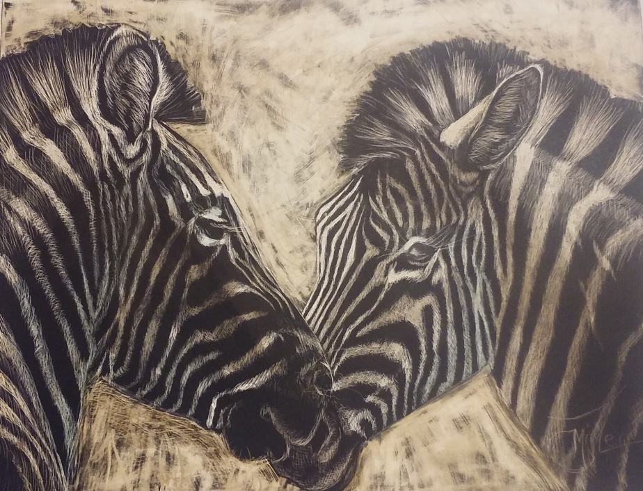
It’s valentines week! So I decided you post a blog featuring my most recent piece titled Zebra Hearts. This piece was done on scratch board and the painting with water color to give a little more detention.


This was a really fun project! I felt like a little kid again. I remember making our own scratch boards in 5th grade art class. This Scratch Board is a piece of masonite with a special ceramic coating and then a black ink scratch layer.
I started by tracing my sketch onto the solid black board with a white tracing paper. Since it was stripes I actually filled in the spaces with scribbled white so that I could keep the black and white stripes separated. It may not seem like it bout working with black and white stripes can get very confusing at times. This is the first scratch board I have done since 5th grade but I guess it is like riding a bike, because I never really forgot. I started by taking my x-acto knife and making hair like scratches on the surface of the white marked areas. I made sure to go in the direction of the hairs in my reference photo that I was granted permission to use by Photographer Sheilah Swanson who works at Wild Life Safari in Winston Oregon.
I made sure to make very light and fine lines in the areas where I wanted it to be lighter but not white. the zebra’s muzzle is one of those places. Hear I did directional scratches and some cross hatching.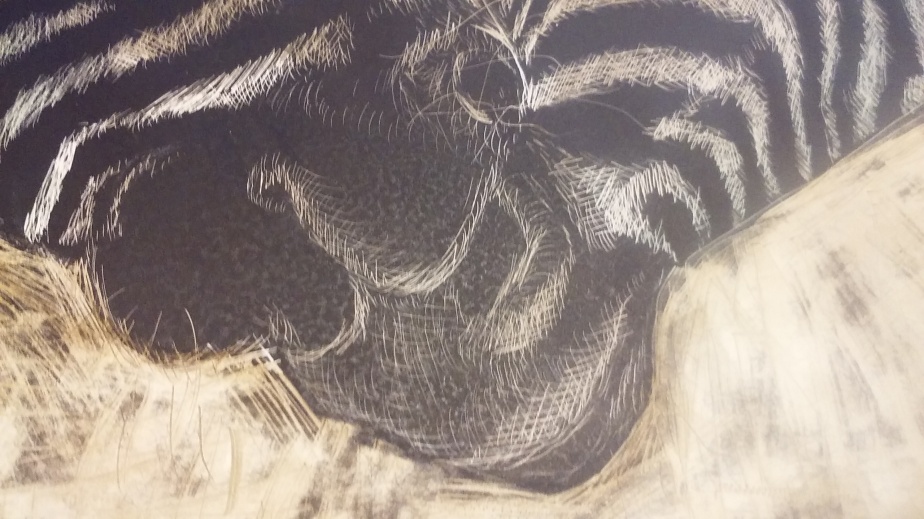
The ears had longer hairs in them, and so I simply made longer intentional scratches so that the hair would look natural and lot like fence posts.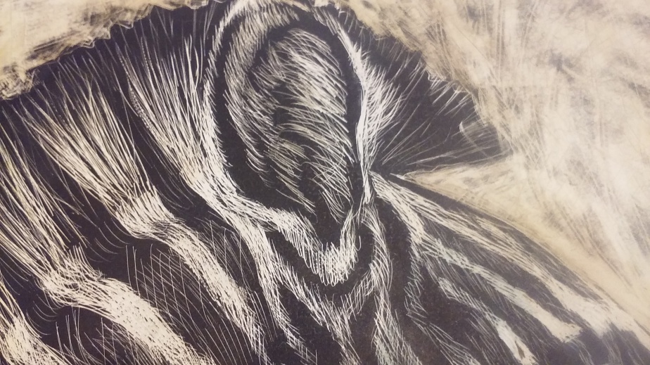
Adding a reflection in the eye was a little tricky as I really didn’t want a high light just a little bit of a haze to show the reflection of the sky. here again I did very fine scratches and cross hatching.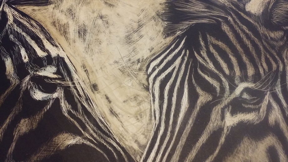
When I had everything scratched in place I slowly used the flat of the x-acto knife and scraped the back ground away. I think it leaves a cool natural looking background. once that back ground was established I used water color paints to the white surface to give detention. I wasn’t sure it would accept the paint but it soaked right in and wouldn’t life out. so if you do this, build up your colors slowly as you wouldn’t get a second chance to lighten it back up. Once the paint was dry, which was with in minutes, I scratched out the very white white highlights. As for signing it, well I simply scratched that isn too!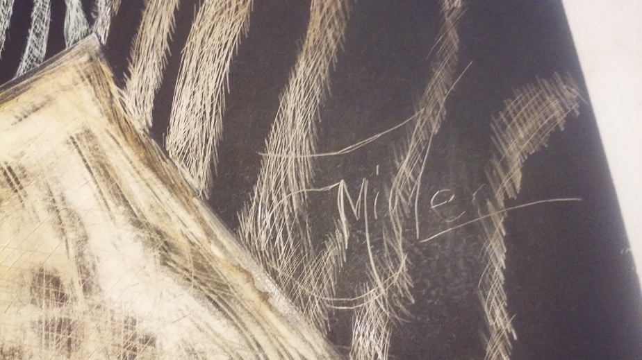
Final result is as 8″x 10″ Piece titled “Zebra Love” ready for framing. $250.00.
If you are interested in purchasing this or any of my art just contact me at Jackielittlemiller.com

Check out my other creations at
![]()

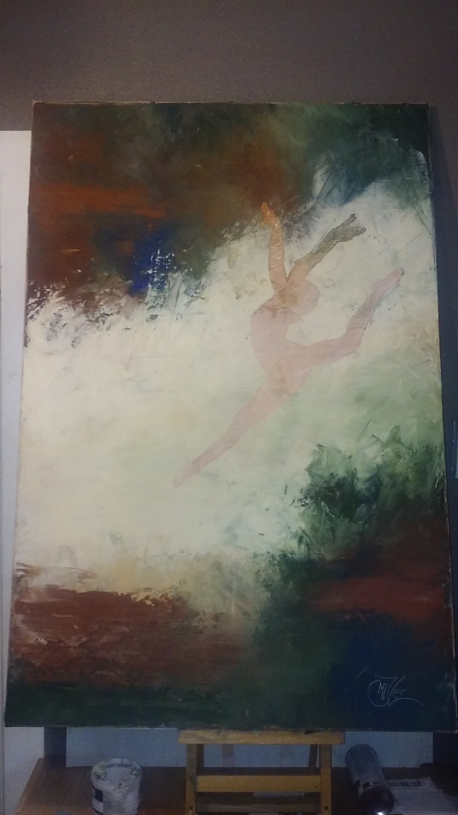
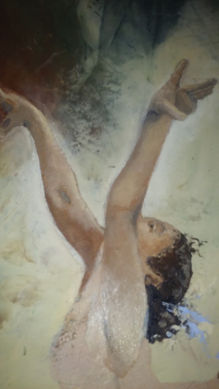
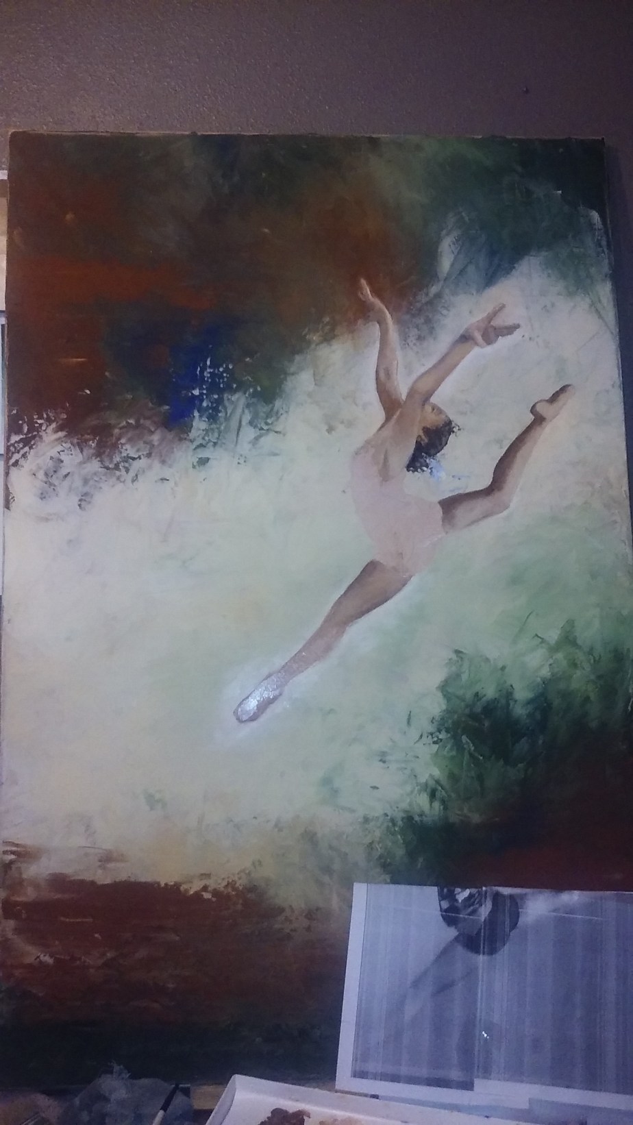
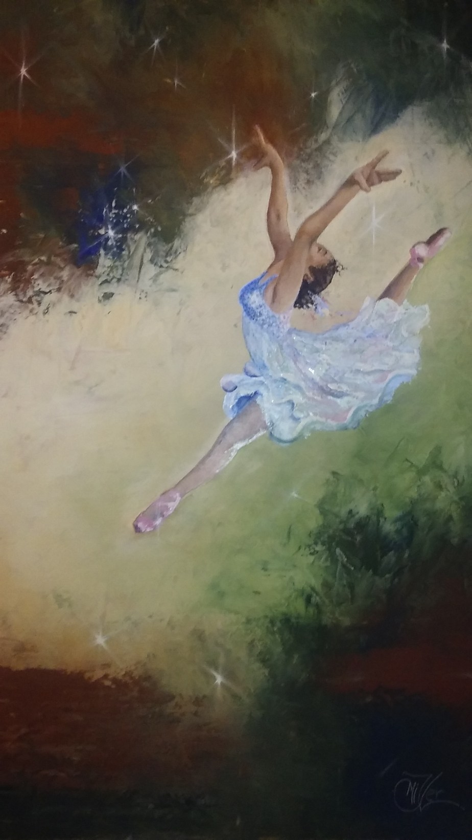
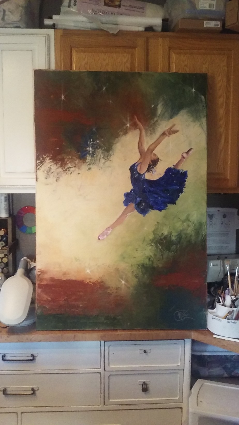
 So you might remember my Leap of Faith painting from about a month ago. This one I did for my Granddaughter who was the subject of the reference photo I used. i really liked the way that painting turned out so I wanted to try it on a larger scale. So I pulled out a 4ft by 2.5ft canvas I have had laying around and started to sketch out the leaper in a larger format to fit the scale of the new canvas.