I’ve been called out in the middle of the night, to race to the bedside of a friend or family member, to help usher in new life many times. With the knowledge that the time was near, I would set out my clothing in a neat pile so that I could hastily put them on and be out the door within minutes of getting the call to action. Unable to fully give into sleep, afraid I might miss the call. Anticipation filled my mind as I lay thinking about how this could be the night. Eventually, the awaited call would come and I would jump out of my bed and rush out the door.
Hours would pass as my sister and I would bathe troubled brows, put pressure on lower backs, and talk women through each contraction; helping them to relax, easing their pain, whispering words of encouragement and love into the ear, and words of the life that was to soon come. Long painful minutes often stretched into back breaking hours of bending over beds with no thought of our comfort, only thoughts of helping to ease and comfort others.
How many time have I held a hand as life struggled to make its way into this world, to take it’s first breath? 50? 60? It’s a moment that takes your breath away, Unexplainable, sacred, and Holy. A moment celebrated with laughter, tears, and relief. And I was honored to be present for so many.
~~~
As I sat by my sister’s bedside Christmas Eve 2017, I reflected on how much the last days and hours ushering life out was much the same as ushering life in.
For weeks I lay in my bed at night, phone by my side, a pile of clothes ready to be put on at a moments notice. But this time instead of waiting with great excitement and anticipation, there was anxiety, my chest tight with sorrow and worry. Tears wet my pillow, as I would see my sister in my mind, wasting away. I was haunted by the thought of losing her. I needed to be there with her, with all my heart. You see, she had been by my side since I was born. She was there for every major and minor event of my life and my children’s lives. I had to be able to care for her, yet I was afraid that I wouldn’t be called in time to rush to her side.
My sister loved Christmas and last wish was to be home for Christmas Eve (The night of their annual Christmas party. She wanted to be with her family. It was a very subdued and quiet party in the living room that night. We all took turns going into her bedroom where there were several chair by her bedside and soft Christmas music playing. Some came in to say their good byes, others crying, some just sitting in silent vigil.
When the hour was getting late, reluctantly, her grandchildren were taken home and tucked into their beds. Christmas music was turned off and we whispered into Sherry’s ear that she had made it through Christmas with the family. All the kids were home in their beds and that it was Ok for her to go to her new home to her eternal life with Jesus.
I was blessed to be able to stay, with a few other family members, to spend one last night with my sister. To tend to her needs, to make sure she was comfortable. I bathed her brow with my tears, Knowing that her pain would soon be over. Whispered words of encouragement and love into her ear, words of the life that was soon to come with Jesus. I held her hand for long emotionally painful minutes that silently slipped into back breaking hours of bending over her bed with no thought of my own comfort, just wanting, needing to do anything and everything I could to ease the last hours of this precious Woman, that had done so very much for me, and that I loved more then life itself !
How many time have I held a hand as life struggled to make its way out of this world, to take it’s final breath? One! It was a moment that took my breath away, Unexplainable, sacred, and Holy. A moment celebrated with tears, sorrow and yet relief. And I was honored to be present for her birthing into Heaven.
My heart aches now, more then I ever thought possible. I have never hurt this bad or this deeply before. Speechless and sometimes breathless, but never hopeless, and maybe even a little jealous. WHY?
Because: I know My Redeemer lives, and I know that my sister is with Him in heaven today, seeing Him face to face. Oh, How I envy her that. For it is what I long for most in life. I long to see my Jesus and thank him for all that he has done in my life! To thank him for giving me such an amazing sister and family, and allowing me to love others as He has loved me for as long as He has planed for me to do so!
Beautiful things rarely happen in our lives without pain being present. Pain is part of life. I don’t fully understand that, or even like it, to be honest. But I know that without darkness we would not know what light is. With out sickness we do not appreciate health, and without pain we could not truly experience joy. I do not understand God and why he chooses to do what He does. I argue with Him quite often, thinking I know better then He does. I also know that He is big enough to handle my little temper tantrums.
His ways are not my ways. I have learned to trust and respect that, surrendering every aspect of my life to Him! Because I know the plans He has for me, thoughts of peace and not evil, to give me a future and a hope! (Jer 29: 11)

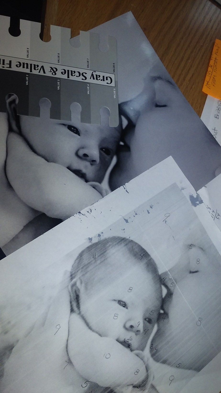
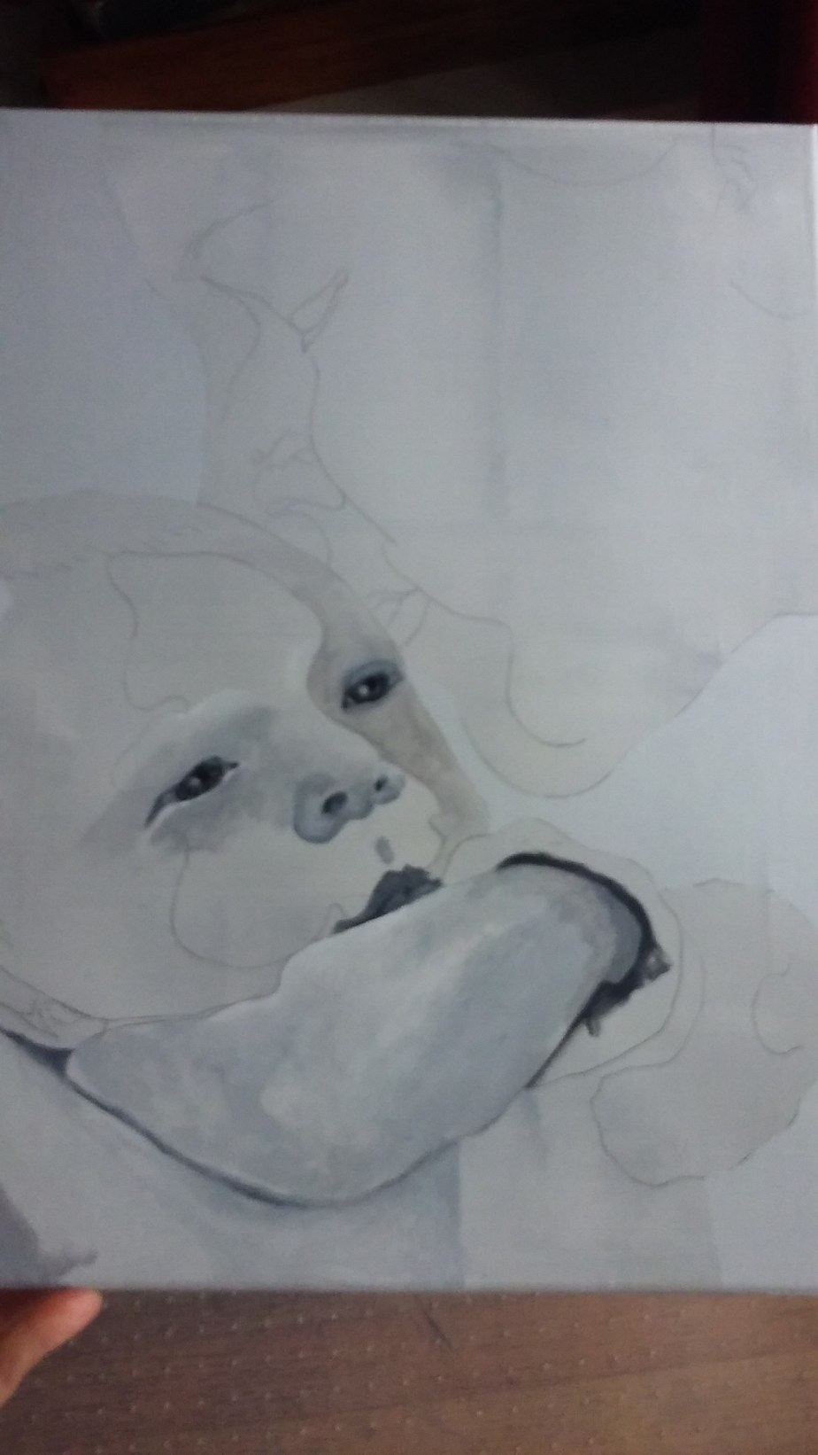
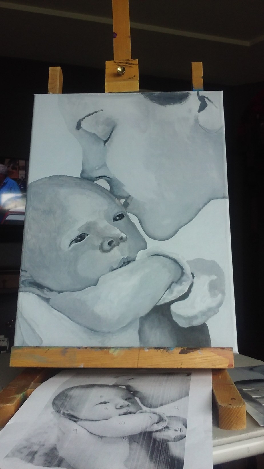
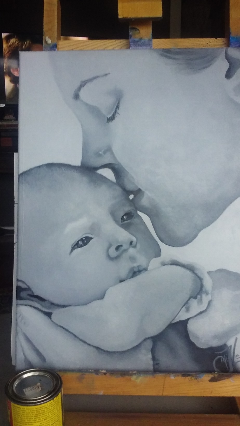


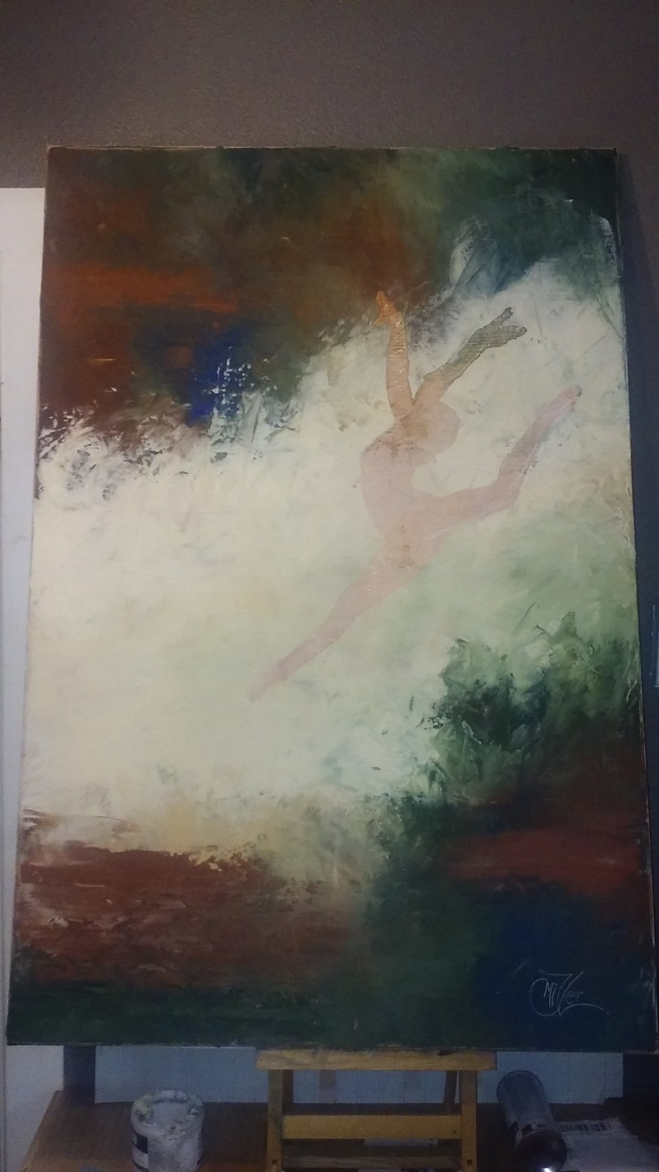
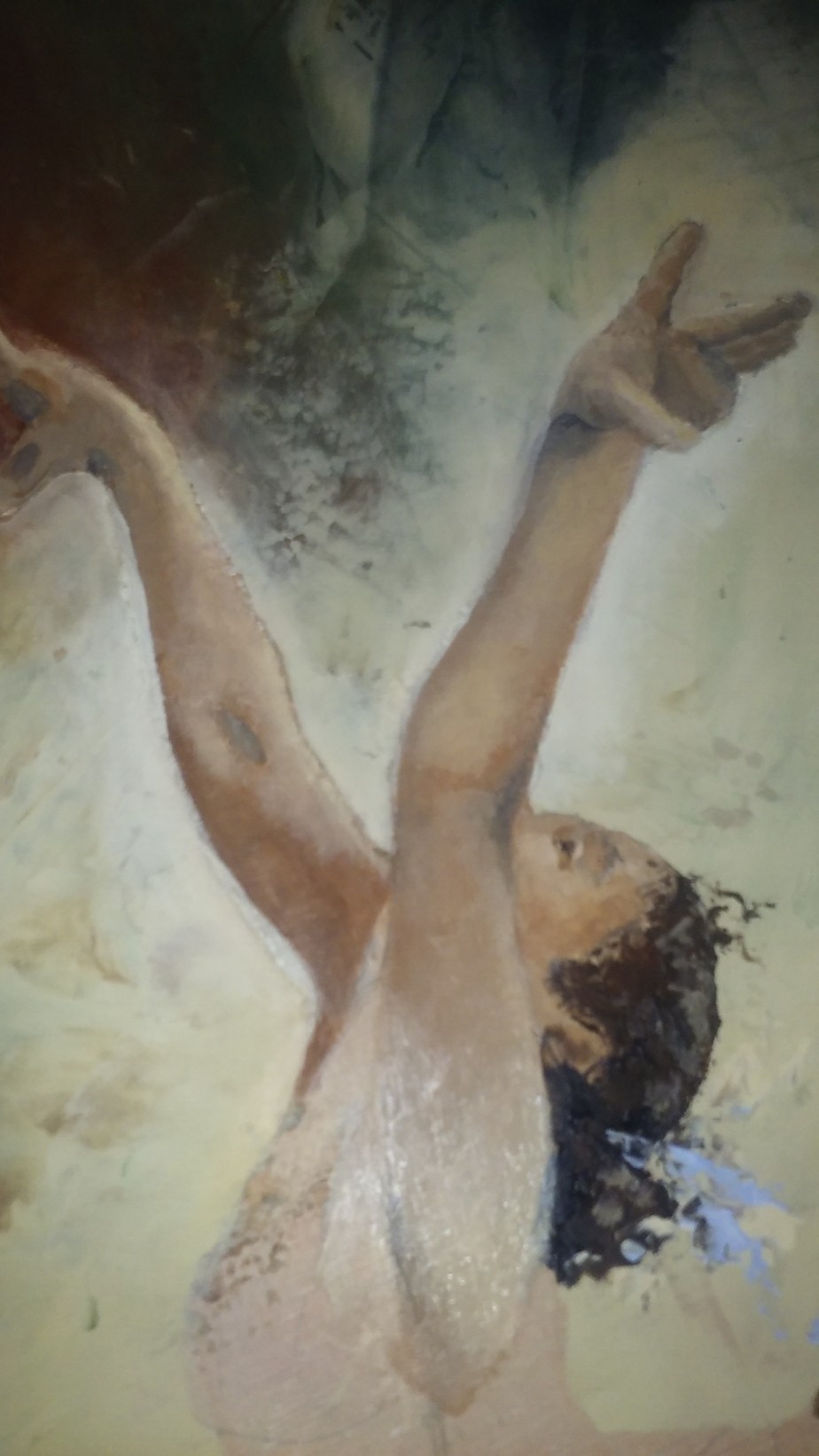
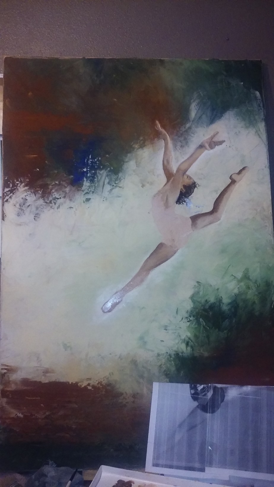
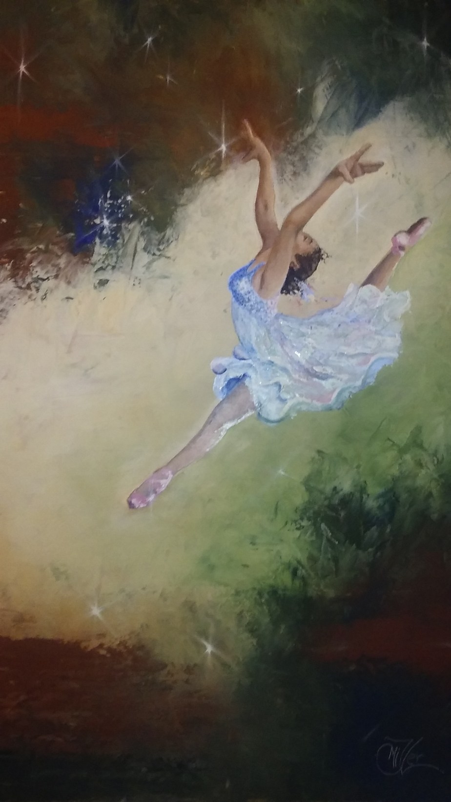
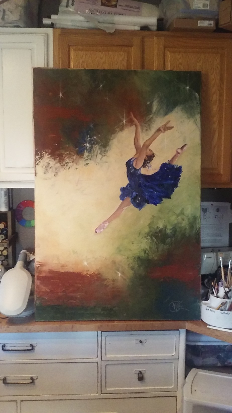
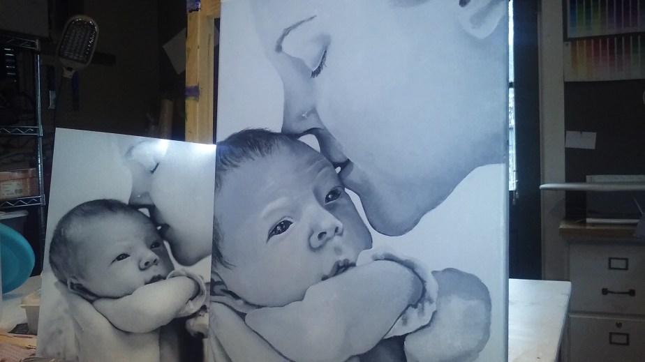
 So you might remember my Leap of Faith painting from about a month ago. This one I did for my Granddaughter who was the subject of the reference photo I used. i really liked the way that painting turned out so I wanted to try it on a larger scale. So I pulled out a 4ft by 2.5ft canvas I have had laying around and started to sketch out the leaper in a larger format to fit the scale of the new canvas.